
Optimising the checkout to reduce churn
MOONPIG | ECOMMERCE
The challenges
- The Moonpig checkout had been built with a highly custom, unusual user flow, on an equally custom, in-house built technology platform that was no longer extensible
- Return visits were declining, new customers were not returning, and other possible causes had been ruled out
- Any suggestions for changes in the checkout journey would impact development times heavily in a planned re-platforming project so justification was key

Core duties
User Experience Strategy
Aligning buying journey design overhaul with broader re-platforming plan
User Experience Design
Personas, User Journey Mapping and Wireframing for web
Analytics and behavioural analysis
Using Google Analytics and Hotjar to understand user behaviours at scale
User research (remote)
User testing on current website and user testing on design concepts
Discovery
In parts of the user journey such as finding and customising cards and gifts, I knew there were already many opportunities for optimisation. I had led the programme to overhaul the usability and structure of the main site navigation and filtering.
To understand the challenges for users in the checkout process, I worked with the Data Science team to understand what users were doing in the checkout. While site entry to purchase conversion stood at 38%, remarkably high for e-commerce which normally saw around 10%, we could see that users were dropping out of the buying funnel at the basket and login screen stages, and in user testing the delivery addresses screen was confusing people
When we reviewed analytics over a period of a year, we found that some existing customers would indeed return repeatedly. However, the numbers of return users were declining. New customers would either drop out in the middle of the checkout process or complete the process and then never return. This echoed sentiments we heard in user testing.
It was clear that we needed to optimise the buying and checkout journey. After users had spent time crafting and customising a card, the last thing they wanted or expected was a long, complex checkout journey.
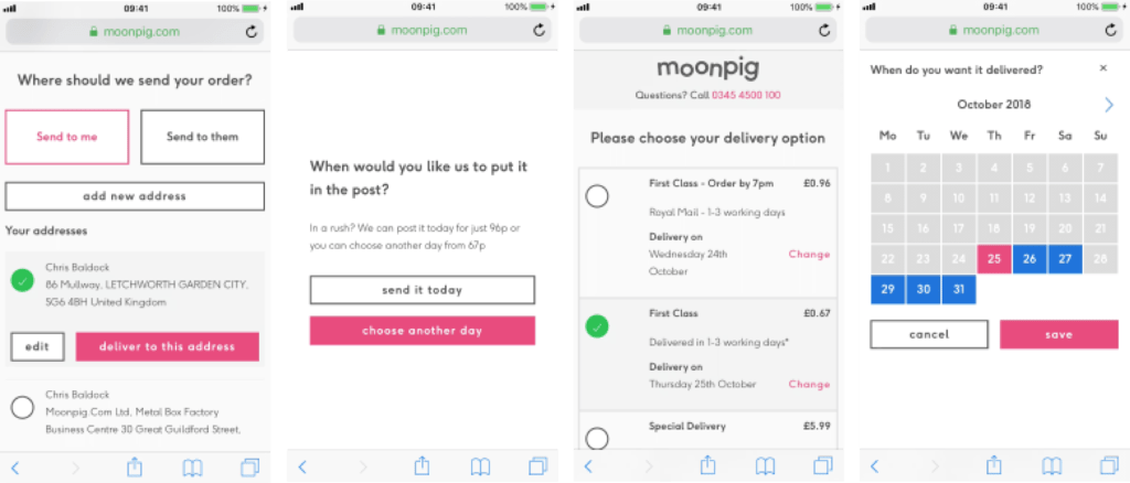
A snapshot of the checkout process
In this snapshot you can see a relatively simple journey where a user was delivering a card to an address already known to them. There are 10 screens dedicated to this decision point. This would be detrimental to any user experience.
The UI styling was also an issue, with large buttons and controls dominating the screen so much that it was often difficult to read the information you needed.
Here’s a quote from a user testing participant. We heard a number of comments like this:
“If I’d been using this website for real, trying to buy a card, I’d have given up long ago”
User testing participant via UserTesting.com

Defining design challenges / hypotheses
The first task was to onboard the re-platforming software development team to the challenges of using the current checkout experience. I was keen to build empathy for customer challenges with a team who may not spend a lot of time thinking about it. There were discussions about re-platforming using the current checkout experience which we knew was sub-optimal, and this was an opportunity to change that. With the development team on board, this was more likely to happen.
One of the key parts of this discussion was to agree on the overall process. At this point, specific project timings had not been established, but we had a good idea of the activities. I was keen for everyone to understand the amount of work required.
After this introduction/review I gathered feedback from the team. It was important to get their buy-in for the product they’d build. We reviewed the data collected in the discovery phase and formed a number of design challenges.

Key design challenges
Delivery address
1
How might we enable customers to choose a delivery address in as simple a manner as possible?
Multi-buy
2
How might we make it simpler for customers to buy multiple cards at once even when sending to different delivery addresses?
Signposting
3
How might we make it clearer where a user is in the checkout journey?
Ideation and sketching
I invited other members of the design team to take part in a “design-sprint” sketching session. Principles like mind-mapping, rapid user journey mapping, crazy 8’s and storyboarding were used.
The aim of this exercise was to explore the buying journey from scratch, imagining that there were no constraints and to imagine the simplest or most delightful way for the user to make a purchase. Ideas like
Taking on board these ideas, I was able to create a a number of user flows through the checkout to be tested against the existing checkout flow. Both versions were built in Figma to reduce any bias.

Hypotheses formed after ideation
Delivery address
1
We believe a simplified method of selecting delivery addresses, via a cleaner UI presented as a simple list, will result in less confusion in this part of the buying journey. We’ll know we’re right if users are able to progress through this step in user testing without any obvious issues or confusion.
Multi-buy
2
We believe that a customised shopping basket with the ability to attach different deliver addresses to different items will make it easier for users to fulfil complex orders. We’ll know we’re right if users can perform this task with ease in user testing.
Note: This was to be compared against the current shopping experience where users could only choose one recipient per order, forcing them to make an entirely new order if delivering to multiple recipients. This was particularly problematic at Christmas, a critical time of years for sales at Moonpig.
Design
I created wireframes to illustrate the user flows, getting a feel for a number of different information architectures and interaction patterns. After internal reviews with technical and business stakeholders, frontrunners were selected for UI design.
I applied a clean, simple UI design aesthetic to these layouts, defining elements that would become part of the Moonpig design system. As we had identified that the current branding was distracting users from the information on the page, I chose a more dialled back aesthetic with the key call to action on the page highlighted in the bold primary brand colour.

User testing was performed remotely on Figma prototypes using the UserTesting.com service. Here is an example of one of the user tests I performed.
User testing
Test parameters:
n=20, 10 UK and 10 USA. Ages 18-65, Male/Female 50/50, Average earnings/education
Key measures:
- Task completion:
- Did participants complete the task they were assigned?
- Did participants think they completed the task?
- Satisfaction:
- Were participants satisfied with their experience?
- Time on task
- Was the time on task considerably shorter in either version?
Journeys I tested:
- Buy a card
- Buy a card and flowers
Results:
Time on task: Average time on task < 2 minutes. This was a vast improvement on the control, and would likely be even faster in real life as users would not need to verbalise what they were doing.
Control:
- Task completion: 15/20 participants completed the task. 5/10 participants deserted the flow saying they would be frustrated by this experience and would not complete it.
- Satisfaction: Average satisfaction score was 3.2/5. Issues such as the amount of steps and confusion of where to click were raised as expected.
- Time on task: Average time on task was > 7 minutes (this was high)
Test variant:
Time on task: Average time on task < 2 minutes. This was a vast improvement on the control, and would likely be even faster in real life as users would not need to verbalise what they were doing.
Task completion: All participants completed the task successfully.
Satisfaction: Average satisfaction score was 4.4/5. This was significant improvement against the control. To improve further, we made notes of some labelling changes and signposting but otherwise the variant performed very well.
Impact of this work
A vastly improved checkout experience, with higher order values and more returning customers

Here
Here you can see the eventual live version of the checkout on desktop. The branding changed a little but the clean aesthetic I created in initial user testing has remained in spirit. After initially choosing a paginated approach which works well on mobile, we were also asked to include a Magento-like stacked version. This kind of interface performs well on desktop, and works well enough on mobile that it was a viable option. While I personally prefer stepped checkouts with visible position indicators as you can see in the mobile designs, in subsequent user tests both versions tested as well as each other and the business leadership were keen to try the Magento approach. What you see on the website now is a hybrid between steps and stacks. It works well, separating decision points in a logical manner.
After
Order values and repeat orders improved significantly once the new basket and checkout features had been built. These features were released as the first part of a re-platforming programme that was targeted to take 3 years. You can see the results of this work on the current Moonpig website where the checkout flow has been optimised based on my work with the team, and on subsequent iterations based on the strategy I created.