
Mapswipe or Maptap?
MAPSWIPE | CHARITY/NGO
The challenge
- The Mapswipe app had been built upon the foundation of a simple interaction pattern: the Tinder swipe, however this was no longer fulfilling the needs of the charities who were relying on Mapswipe to provide human population mapping data
- New features needed to be introduced to the app so that users could make more of an impact with their mapping activities
- As the only interaction pattern in the app was currently the “swipe”, changing this would mean a fundamental change to the interactions in the app, and the highly dedicated user base would need introducing properly to the new UI

What is MapSwipe?
Mapswipe is a unique app that enables user to view satellite images of remote areas in the world and flag where they believe human civilisation has popped up. This service is used by organisations such as The Red Cross, Medecins Sans Frontiers where population mapping can mean the difference between life and death for thousands of people.
In poorer countries, new townships can appear almost overnight with thousands of undocumented and potentially unsafe people living and working in them. These townships rarely have working amenities like water, electricity and sewage. The people living in them can be taken advantage of by unscrupulous local warlords and despots. MapSwipe helps organisation find these townships and ensure the health and well-being of their citizens.
Humans are still needed to assess these images. At the time of writing, AI image recognition systems aren’t so great at recognising building in blurry images. It’s how ReCaptcha exists, to train an AI. You’ll notice that even with ReCaptcha, the images are generally pretty clear and of good resolution. With satellite imagery, resolution is generally down to around 1 metre per pixel.
Tindrification
Back in the mid 2010’s, there was a drive to add the Tinder swipe-left, swipe-right interaction to many application where the interaction pattern might have not been the best. This happened with the original MapSwipe app. Users were simply to swipe left if they could see human civilisation, or swipe right if they couldn’t or weren’t sure. This simple interaction was a success with early users of the MapSwipe service but it became clear quite quickly that the simple swipe interaction might not be enough for all user cases.
Enable users to do more, at a faster pace
The MapSwipe team and I discussed several interaction patterns to enable faster or more detailed mapping. One of the key things to remember with MapSwipe is that it’s an app with limited, niche appeal and most users are dedicated, super-users. This means that slightly more complex interactions than the standard tap and swipe can be utilised.
One of the key interactions was with a grid overlaying an image. The grid pattern enables the user to flag multiple regions with different flags before swiping to the next screen. This enables 6x more images to be assessed compared to the older single-image swipe interaction pattern.
There was a comparison view, where before and after images were compared. User were deciding whether building that were previously there have disappeared, or any other substantial changes in human activity.
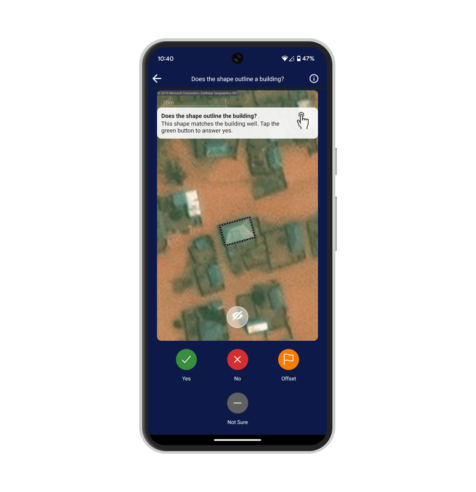
Finally, there is an image alignment view where users have to judge whether a mapping region has accurately matched a building. These mapping regions are manually drawn by attendants to Marathon sessions, or at home, using tools like Open Street Maps. While users do their best to be as accurate as possible, using satellite images from different satellites often creates issues for alignment. Also, if satellite images are taken a year apart or longer, building footprints can change substantially.
Remote user testing
We generally used Zoom for remote user testing as the mappers we were interested in speaking to were located in Western Africa. Screen sharing was already working quite well at this point and for me this was a great testing ground for where we’ve moved to now with moderated user testing. Once the domain of specialst providers like Silverback and UserTesting, Zoom and Teams let us perform worldwide user testing for little or no cost above and beyond providing cash incentives where required.
Results
A more useful, more beneficial app, that has helped users map millions more regions of map data to better inform humanitarian organisations where to spend their efforts

The end result is now an app that enables much faster, much more detailed mapping and validation. The MapSwipe app is even more helpful in allowing charities and NGO’s to better understand where to deploy their valuable resources worldwide. Every tap is a potential life saved.