
Integrating MUI and Revolutionising a B2B Product
LOW CARBON CONTRACTS | ENERGY SECTOR
The challenge
- A contract management platform (Zero) had been built with little design oversight and was difficult to use
- The company had recently rebranded and the Zero system had lagged behind
- Scheme delivery schedules and deadlines meant that prioritising UXUI changes would require constant negotiation

Core duties
Project management
I created a plan for the overall project including a roadmap and delivery schedule
User testing
User research completed on concepts and prototypes using Figma and Teams
UXUI Design
From wireframing to high fidelity UI and prototyping
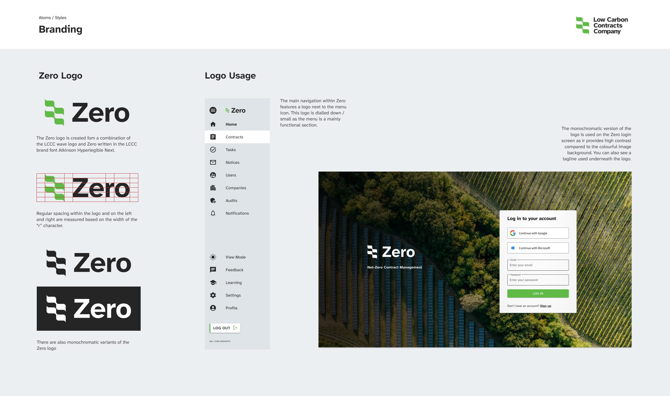
Design System
Using the MUI platform I created a design system making it quick and efficient to build new views
Understanding the problem
There were two key problems to be addressed at the same type:
- Rebranding the platform
- Fixing major, systemic usability issues
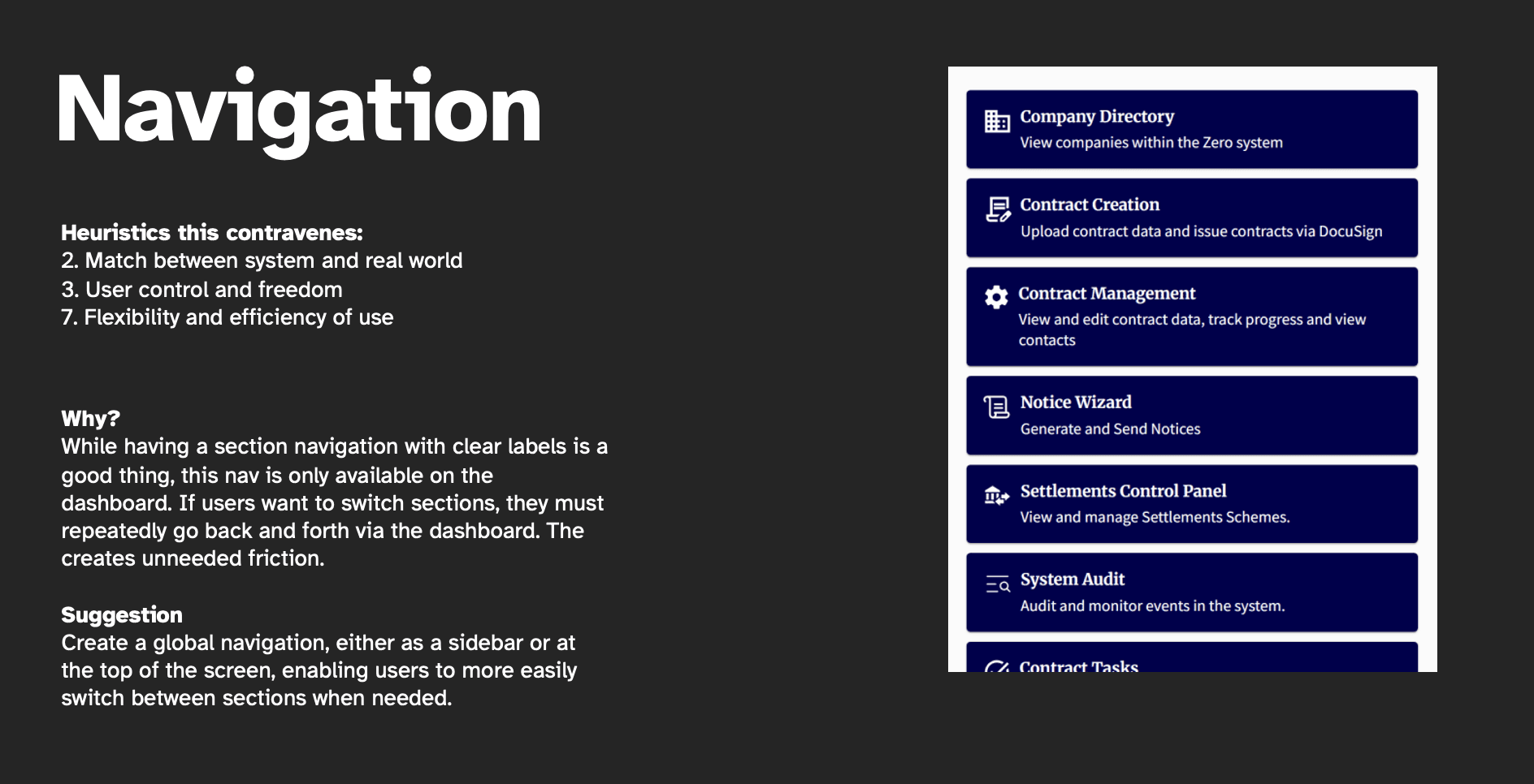
My first task was to perform a heuristic review of the system. This highlighted key areas where usability was particularly poor. These included:
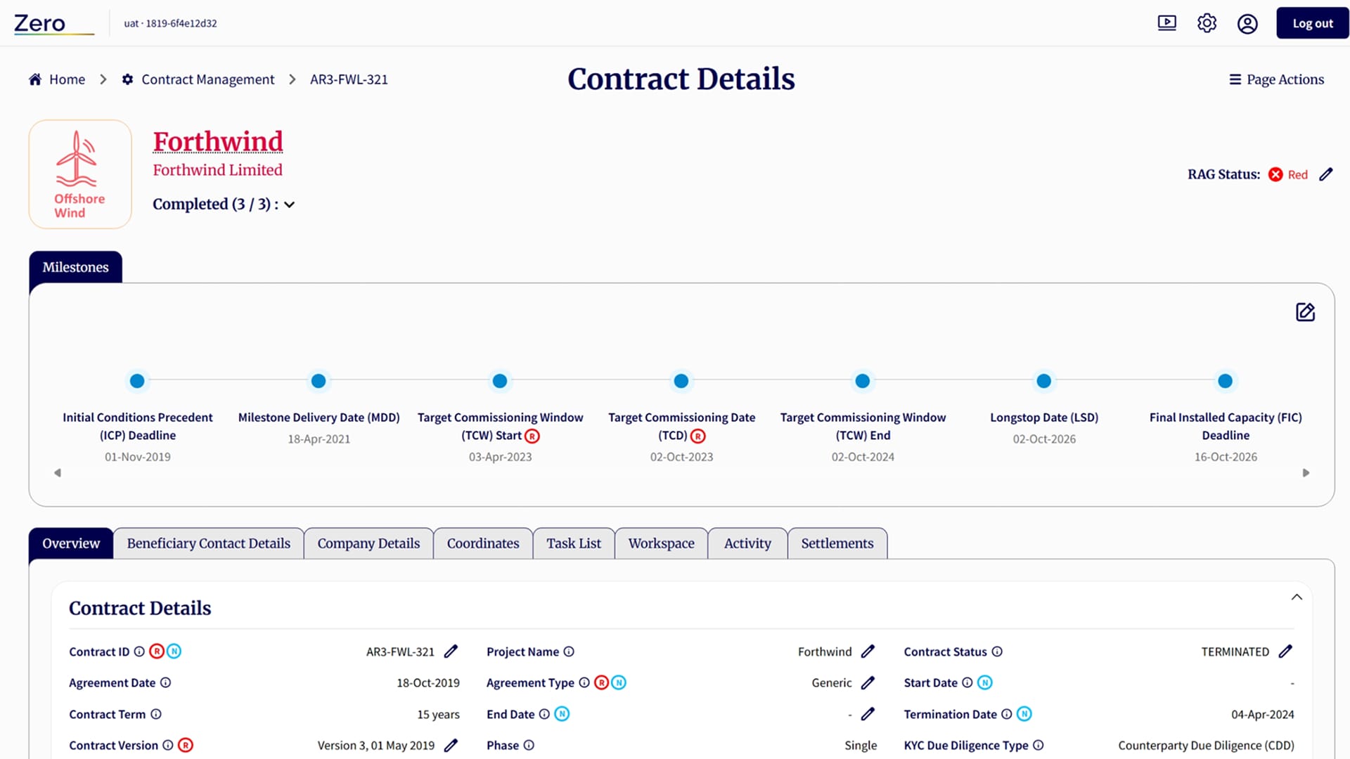
- A lack of global navigation
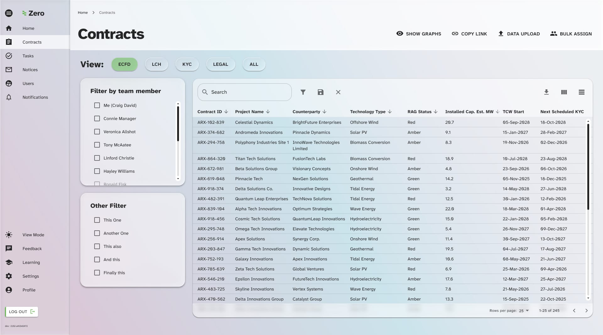
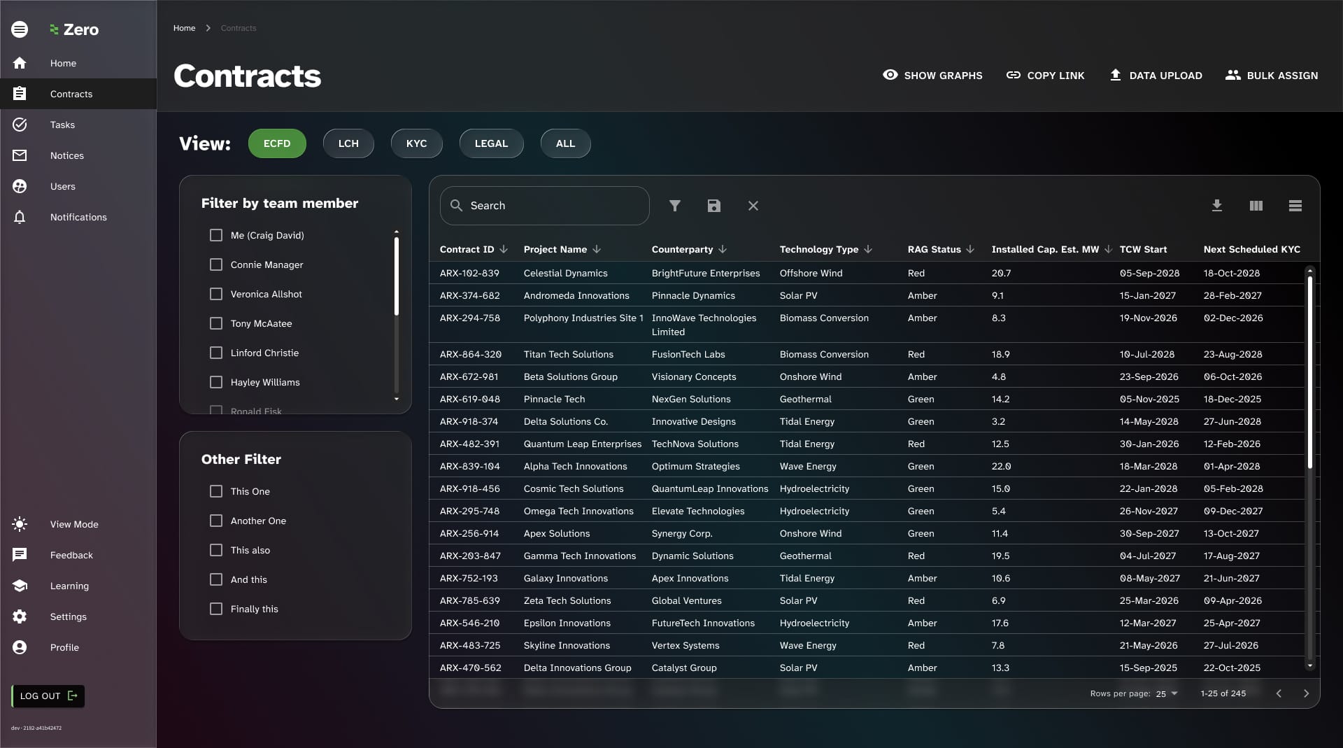
- Heavy reliance on database-like views that overwhelmed users
- Over reliance on full-width blocks which impacted legibility
Where rebranding was concerned, I already had a head start as the corporate website had already been given a rebranded look and feel.
However, the dark background colours of the new brand approach were not deemed as universally suitable for all users of the Zero platform. After several user interviews, users tended to either prefer light mode of they’ve want a choice of view-switching.
The web app needed to act more like a professional, native app than a website.
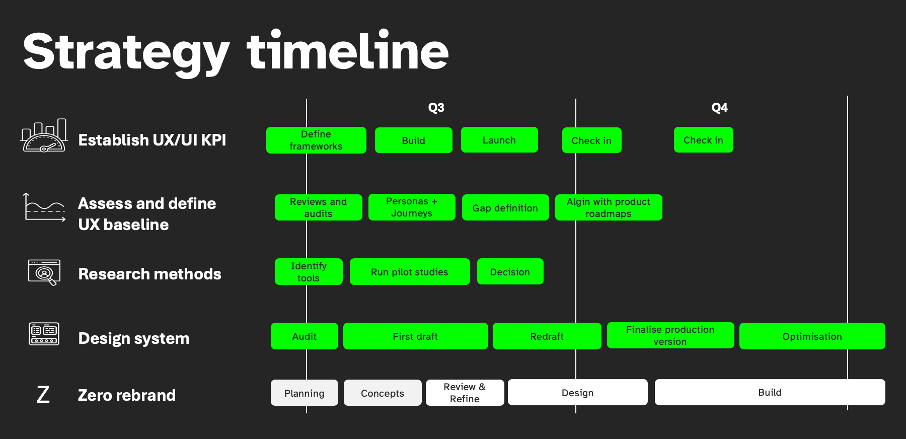
Scheduling and alignment
The implementation plan went as follows:
- Design concept period (around 2 wks) to lay down the foundation for the look and feel
- Alignment with dev team on the approach, either simple colours and fonts or implementation of a re-factored UI
- Rebranding and design system work were separate workstreams as the design system was more for setting up for the future while the rebrand and optimisation were more immediate delivery
- Tandem production of a style guide alongside maintaining the MUI component library
- Also needed to balance other core UX activities alongside this piece of work as I was essentially setting the foundations of UXUI from scratch including defining platform measures of success and user research methods that I and business analysts could use in our work
Optimising usability
Several key areas were highlighted for usability improvement. They were as follows:
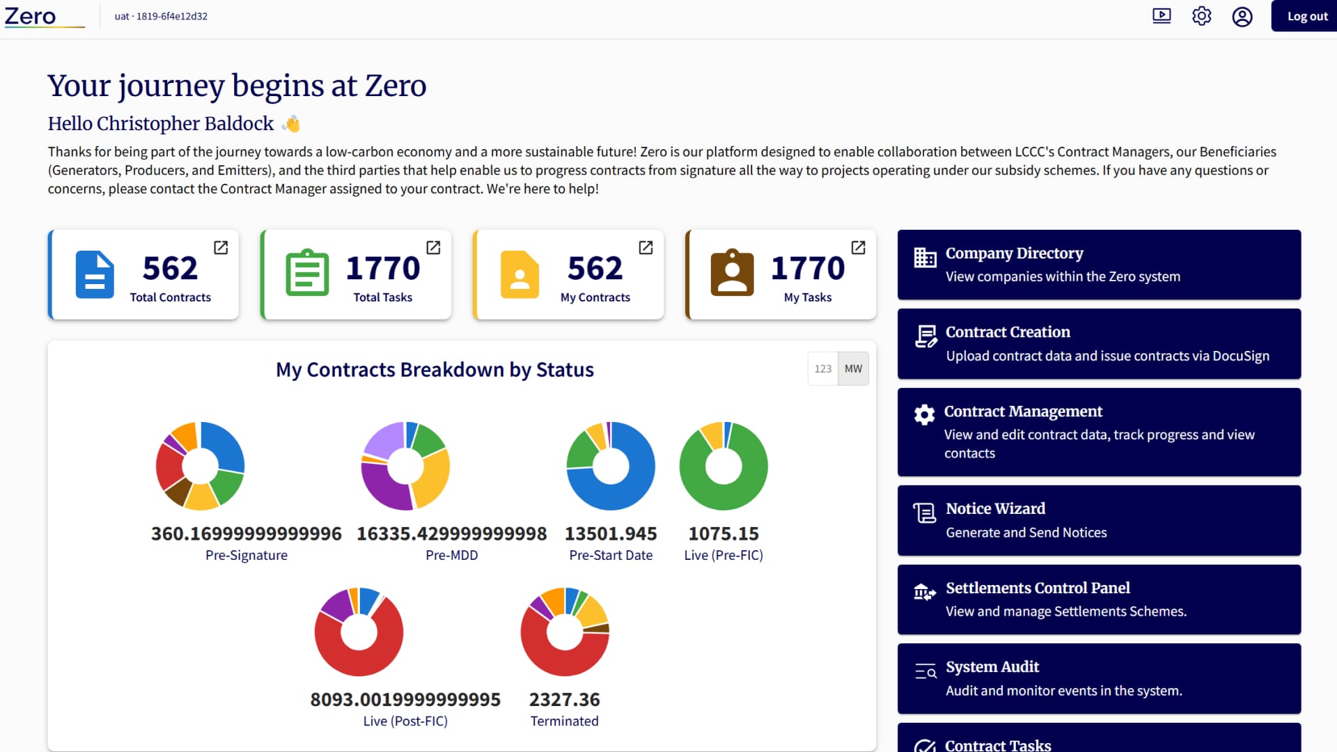
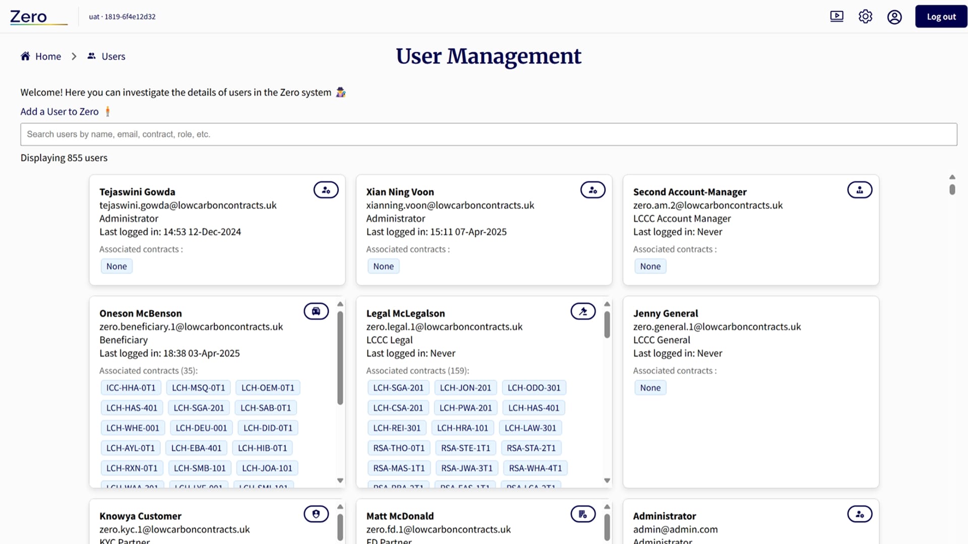
- The addition of global navigation. Users were pogoing between the home page and other pages in the system as there was no global navigation.
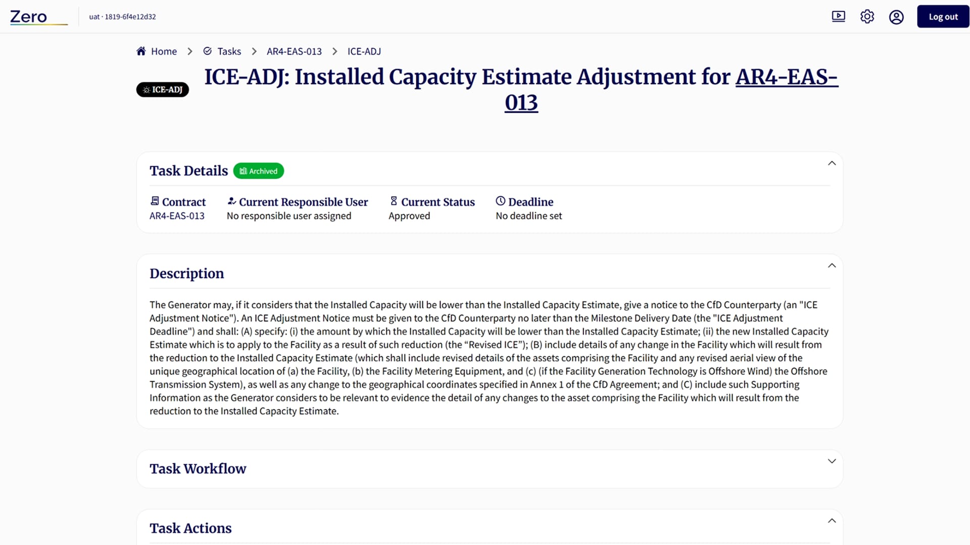
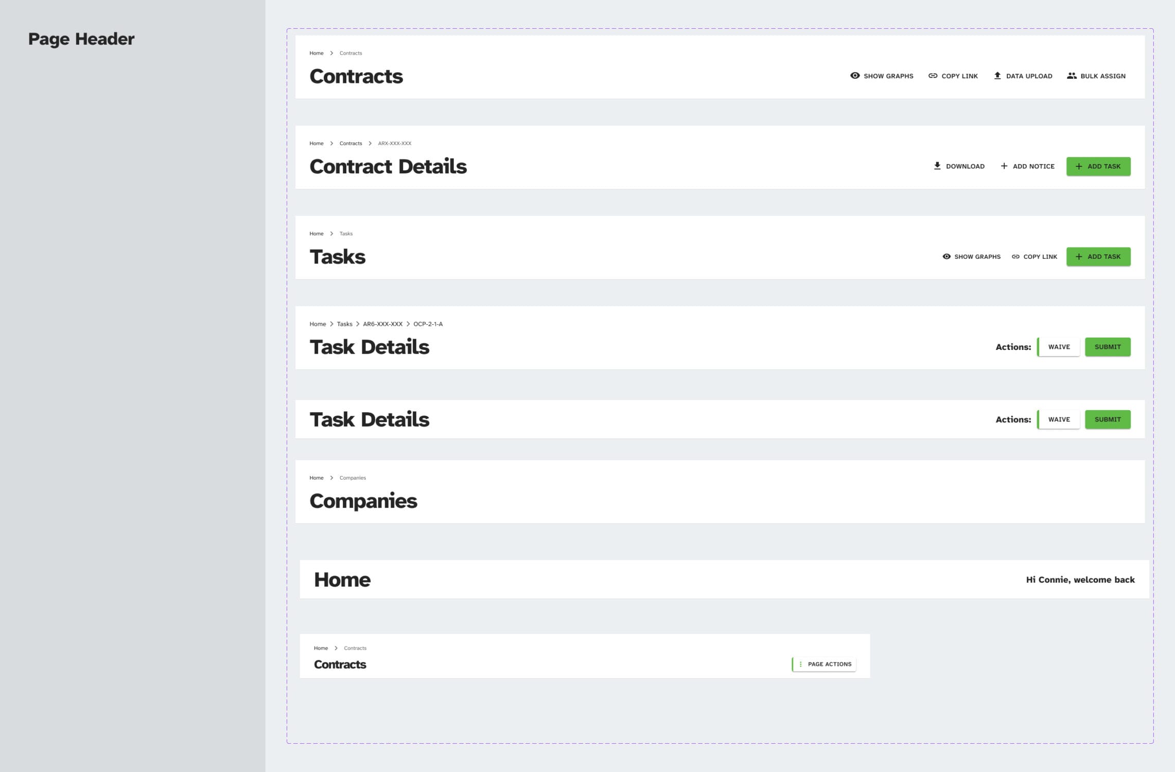
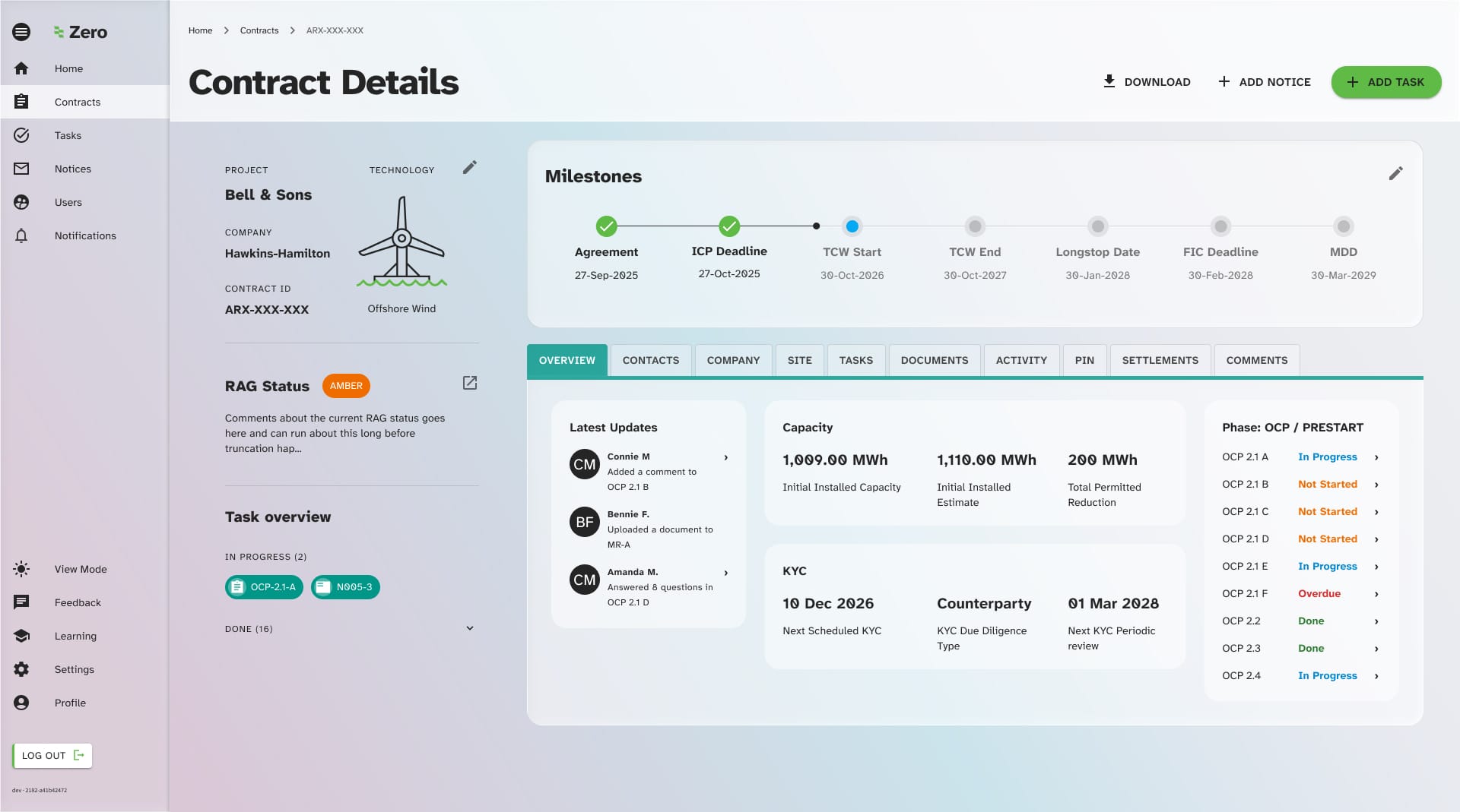
- Improving task details: Users of the system interact a lot with the task details screen, however its layout was unorthodox and the page was difficult to use and understand.
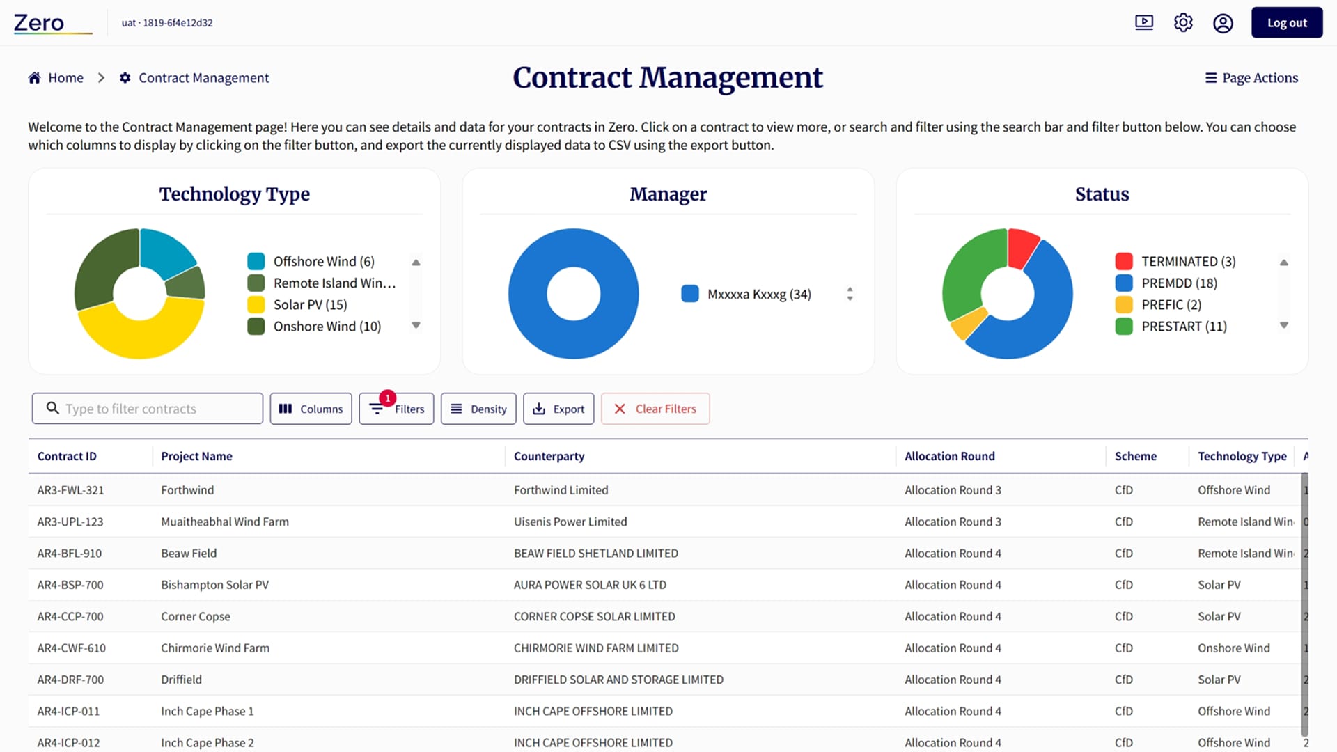
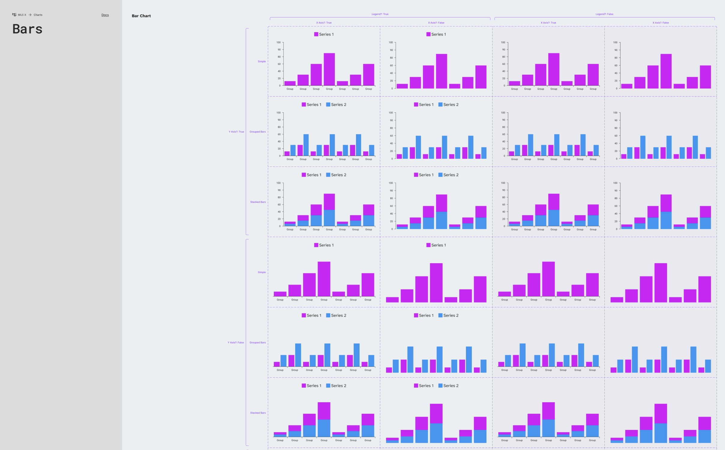
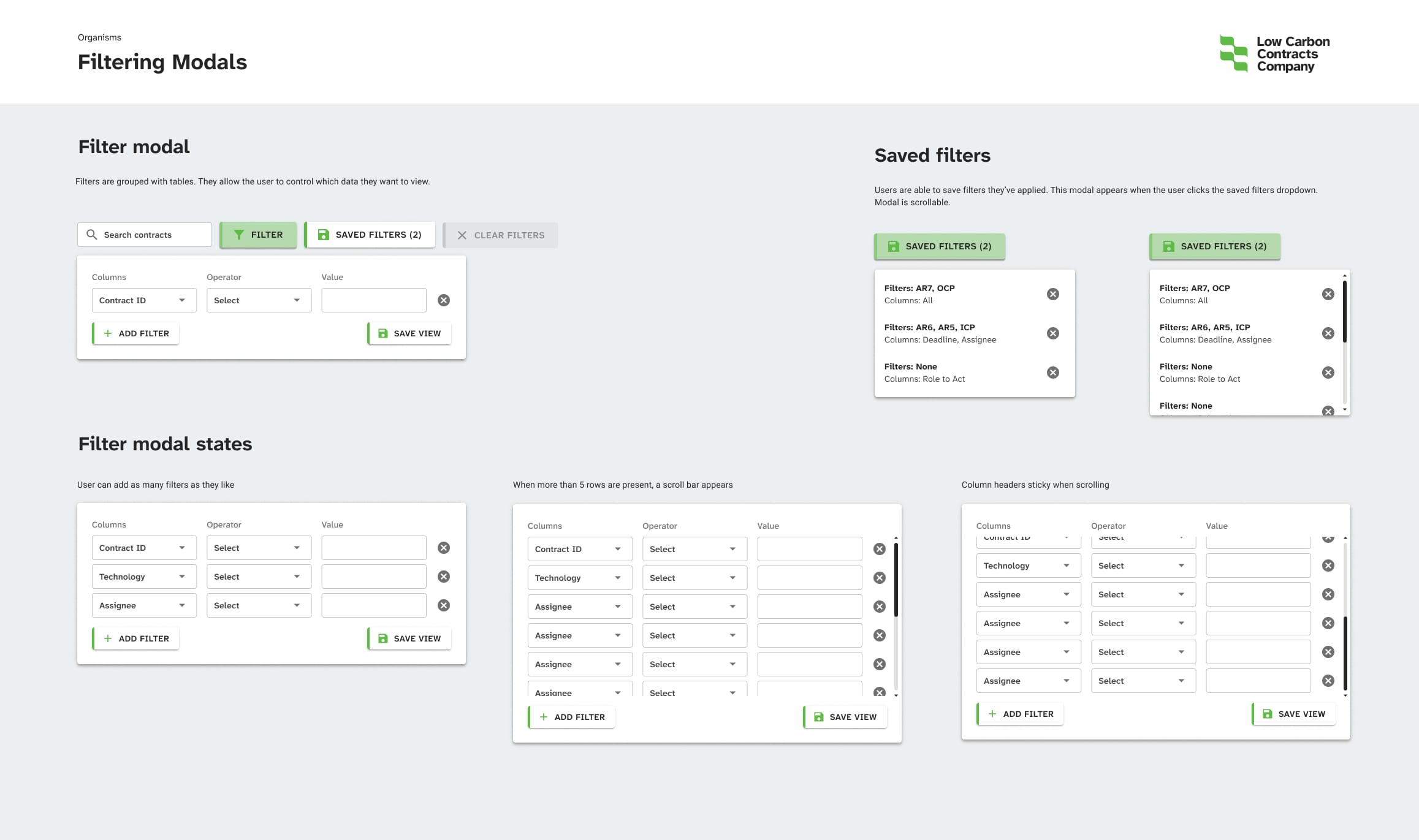
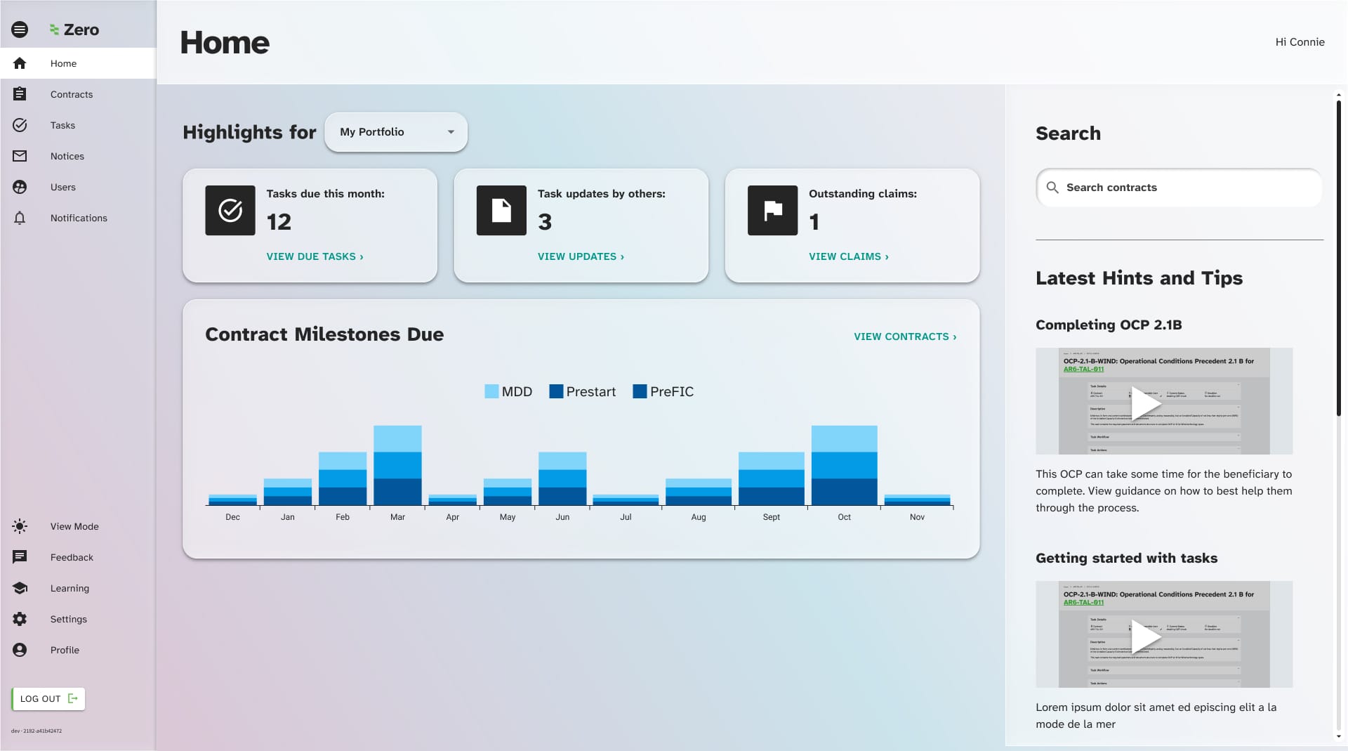
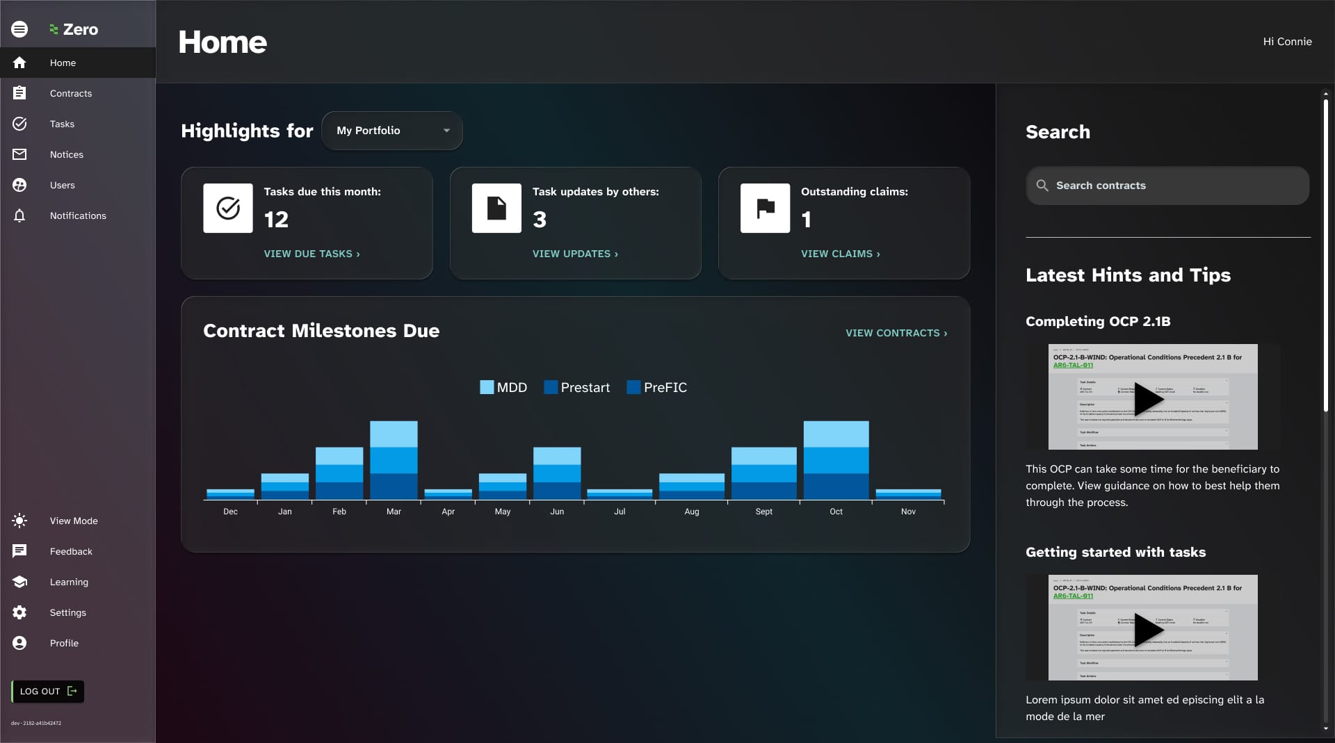
- Data visualisation: Most of the data in the platform was being visualised using donut charts which were often not optimal for the use case.
- Harmonisation of tables: Data table views are used in several places within the system and needed to be harmonised
- Proximity of elements: Throughout the platform, data label/value pairs were being laid out in a confusing manner that was difficult for users to scan
Design hypothesis examples
Task Details
1
We believe that a sidebar view combined with a more focused actions area and progress controls being moved into the page header would result in a more easily digestible and usable task details page.
Data visualisation
2
We believe that mixture of line graphs and stacked bar graphs would drive better decision making with clearer data points linked to useful actions from key dashboard pages.
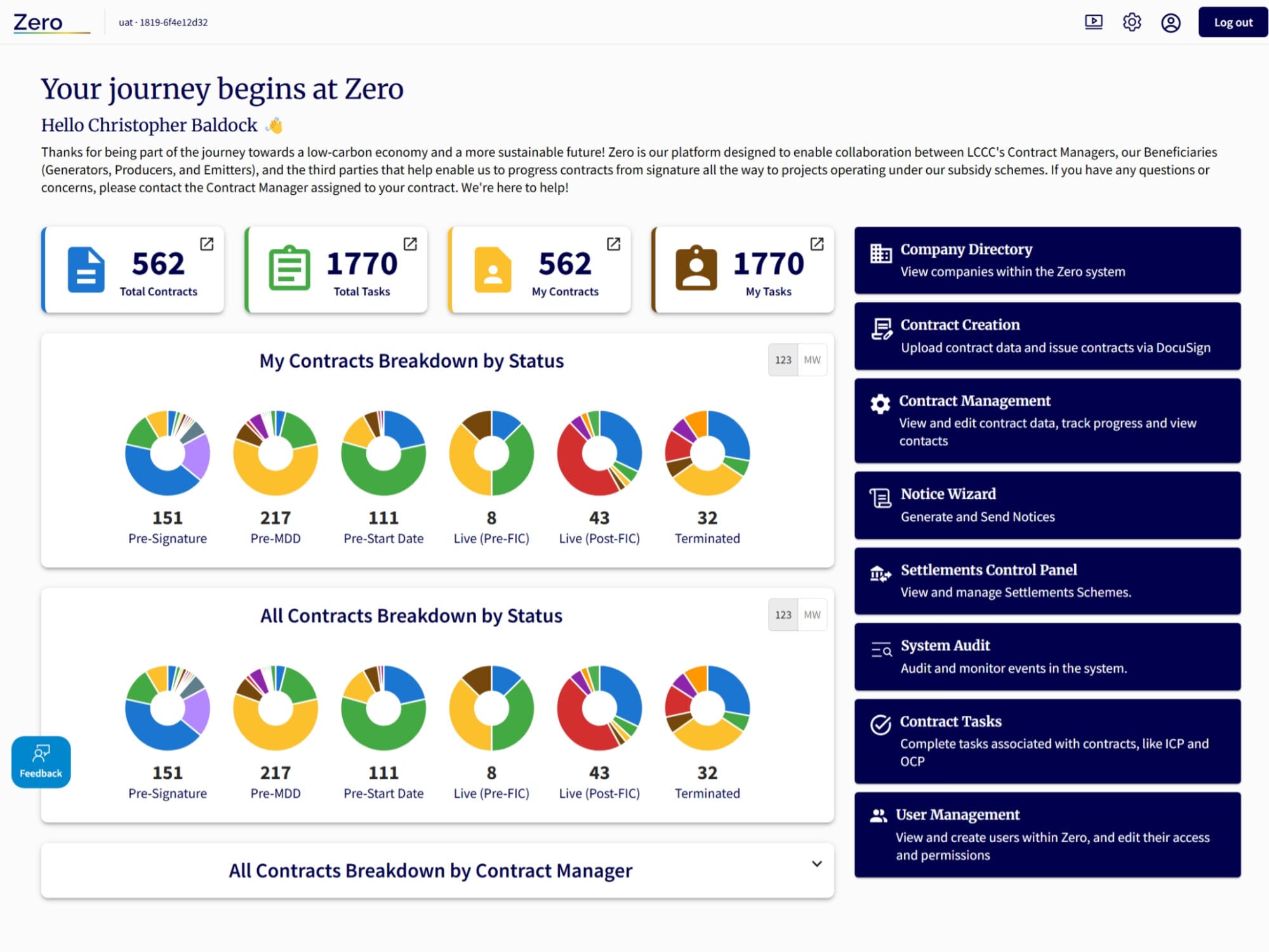
The system UI to be overhauled
While this UI was a part of working, functional software, users were regularly complaining about poor usability when completing key actions within the system.
The mix of colours was unusual and unattractive, and there was a lot of superfluous text and information that might have been useful on first visit, although that’s arguable as users tend not to read detailed text instructions or welcome messages.
There were some positives to take, such as regular patterns being used to represent data, and some of that needed to be maintained to reduce shock for users who were a mixture of internal business users and external clients.
I also wanted to factor in mode switching, especially as the company represents carbon neutrality, so on most monitors and screens the darker colours use less energy so providing that option would be energy efficient.
Utilising MUI
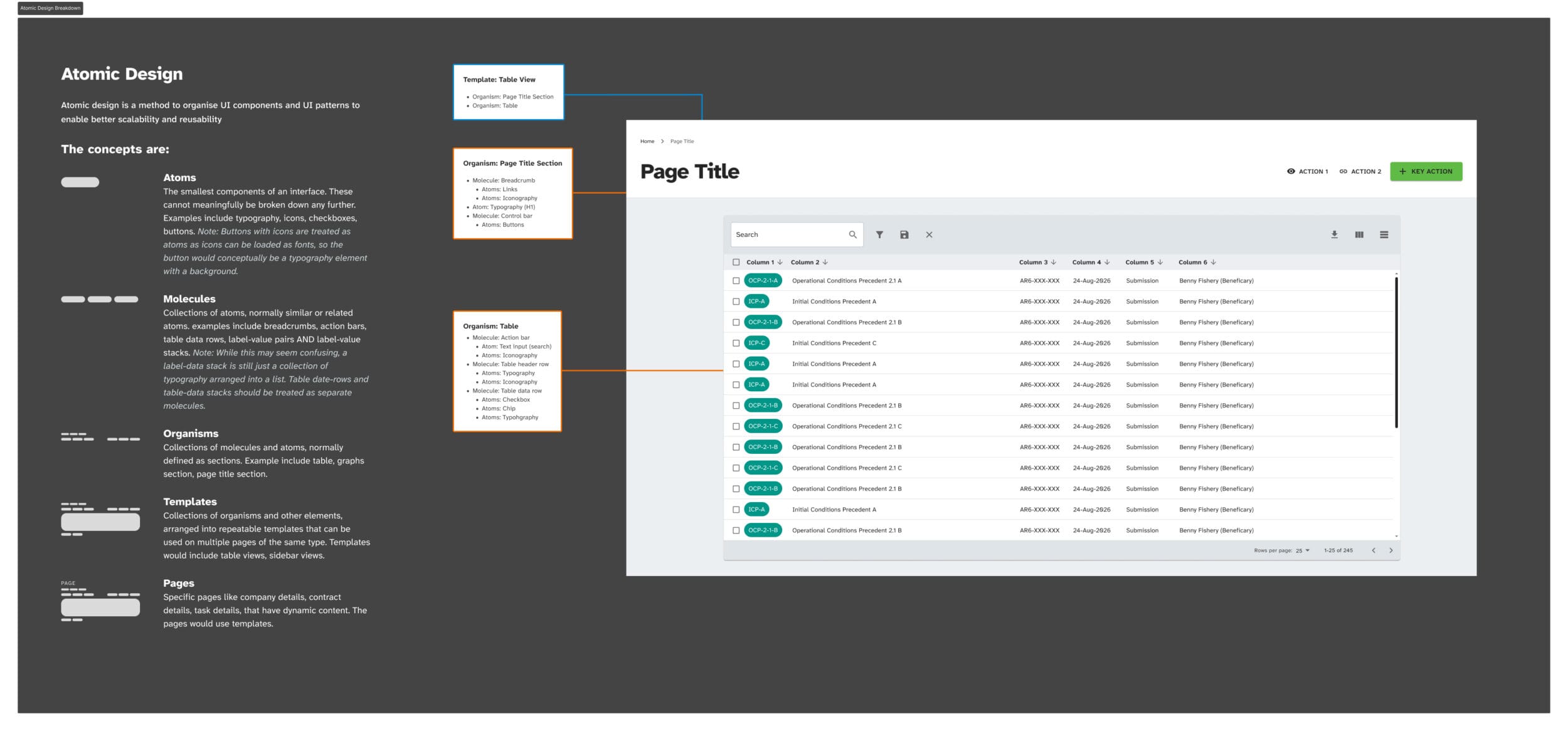
MUI is a design system created by the team at Google which integrates with React and Typescript, which are commonly used, repeatable and dependable UI systems. The team had already started to experiment with building MUI elements alongside a platform mostly made from custom components.
As the MUI design system doesn’t have an integral concept of atomic design principles, I also created a separate style guide that merged both concepts, including guidance on how and why to use certain elements and templates.
The development team were struggling to conceptualise the component mapping without an atomic system described to them. The MUI system alone was not enough. This was a key learning in this project about the continued value of atomic design (thanks Brad Frost).
New UI Designs – Light Mode
New UI Designs – Dark Mode
About the UXUI approach
Surfaces
Colours were rationalised to provide clear distinction between surfaces for background and foreground UI elements.
Sidebars were given lower UI prominence as they’re a contextual guide rather than something you need to interact with
Planning for adaptive content
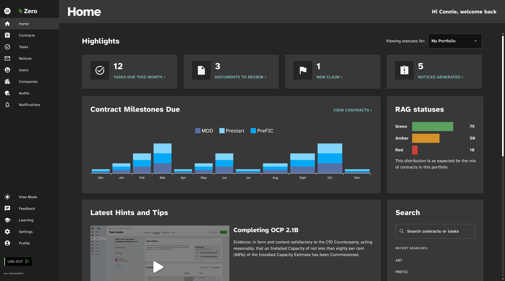
- The home page, contract list and contract details pages while somewhat dynamic, but not personalised for users in any way.
- Multiple methods to automatically or mnually save page states were created to enabled users to tailor their experience.
- The home pages were personalised per user type to enable a better focused experience highlighting key actions.
- Settlements overviews were reorganised into a more digestible snapshot of current status
Colour to highlight key actions
Rather than brand colours being over-used, colours are present to highlight key actions or signposts. While this seems obvious, it had been somewhat overlooked in the previous iteration of the system.
User testing
Using a mixture of in-person and via-Teams approaches, several rounds of user testing helped me to refine the product.
Most of the initial design choices and hypotheses were positively proven out, however there were key tweaks that were important to take note of:
- Data-grid views, while commonly used, could be overwhelming on large screens. Future optimisations would move away from these types of views.
- Task details screens were very well received, however the users would benefit from instructions per step in each task, much like learning platforms where each course step has specific instructions
- Some users, especially clients, preferred a simple, uncluttered home page so their personalised version would be a simple list of key actions they need to take rather than a data visualisation dashboard that internal staff preferred.
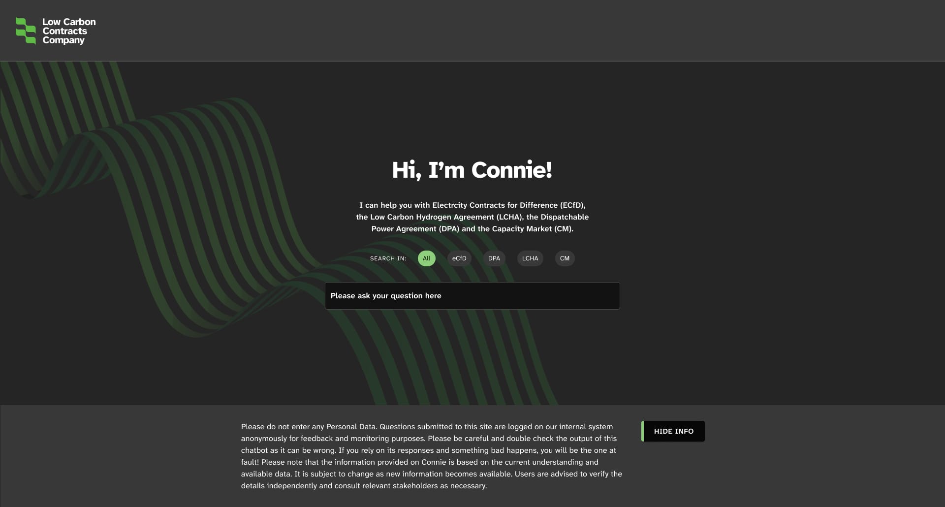
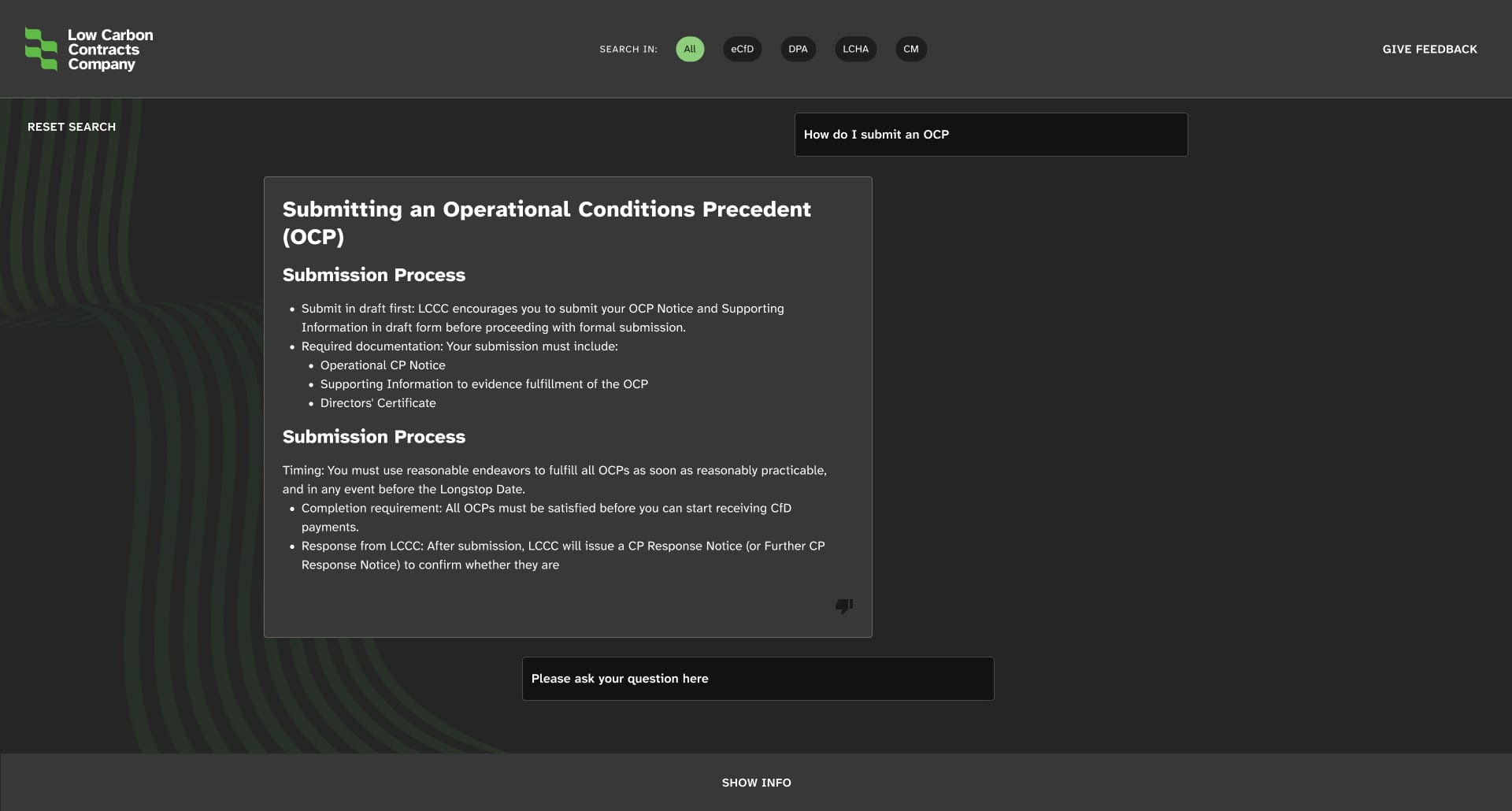
AI Usage and Integration
Every modern product has some flavour of AI either within the product or driving the creation of the product.
I used AI tools to create artifacts that assisted the design process such as personas, flow diagrams, documentation in Confluence and content production in Figma, however at the time AI tools were not able to generate realistic UI concepts so that was still a manual process on paper/Miro/Figma.
The system itself has an agentic AI tool to assist users in understanding complex contractual terms. This helps to save costs as clients are less reliant on contract managers.
Project outcome
A fresh new look, better usability and improved user satisfaction
After implementing these changes, user satisfaction increased from 68% to 84%. Plans for future optimisation were created based on user feedback and alignment with broader scheme delivery objectives such as more data visualisation in-platform and enabling more in-platform communications.
See
See the site