Creating a new brand for acoustic consultancy
ACOUSTIC CLARITY | SMALL BUSINESS
The challenge
- My client’s business, NACSound, had been struggling to generate sales leads
- Comments and user feedback had been received from architects and engineers that this website doesn’t represent what is required for an acoustic consultancy
- My client wanted to understand whether to split his acoustic consultancy business from his speakers and sound sculptures

Core duties
Project management
I created a plan for the overall project including a kickoff workshop for the client where I shared this plan, design and development timelines and key priorities and goals to achieve
User Experience Design (web)
User personas, user journey mapping and wireframing
Brand design
Creation of graphic assets and brand identity
UI design
With real stroke survivors who had experienced a range of impairments
Website build
Entire website custom built to match UI designs, built on WordPress platform for ease of publishing and post-maintenance
SEO
Content writing and publishing, and keyword tracking to ensure a rapid rise in Google ranking even for a very young domain
Discovery
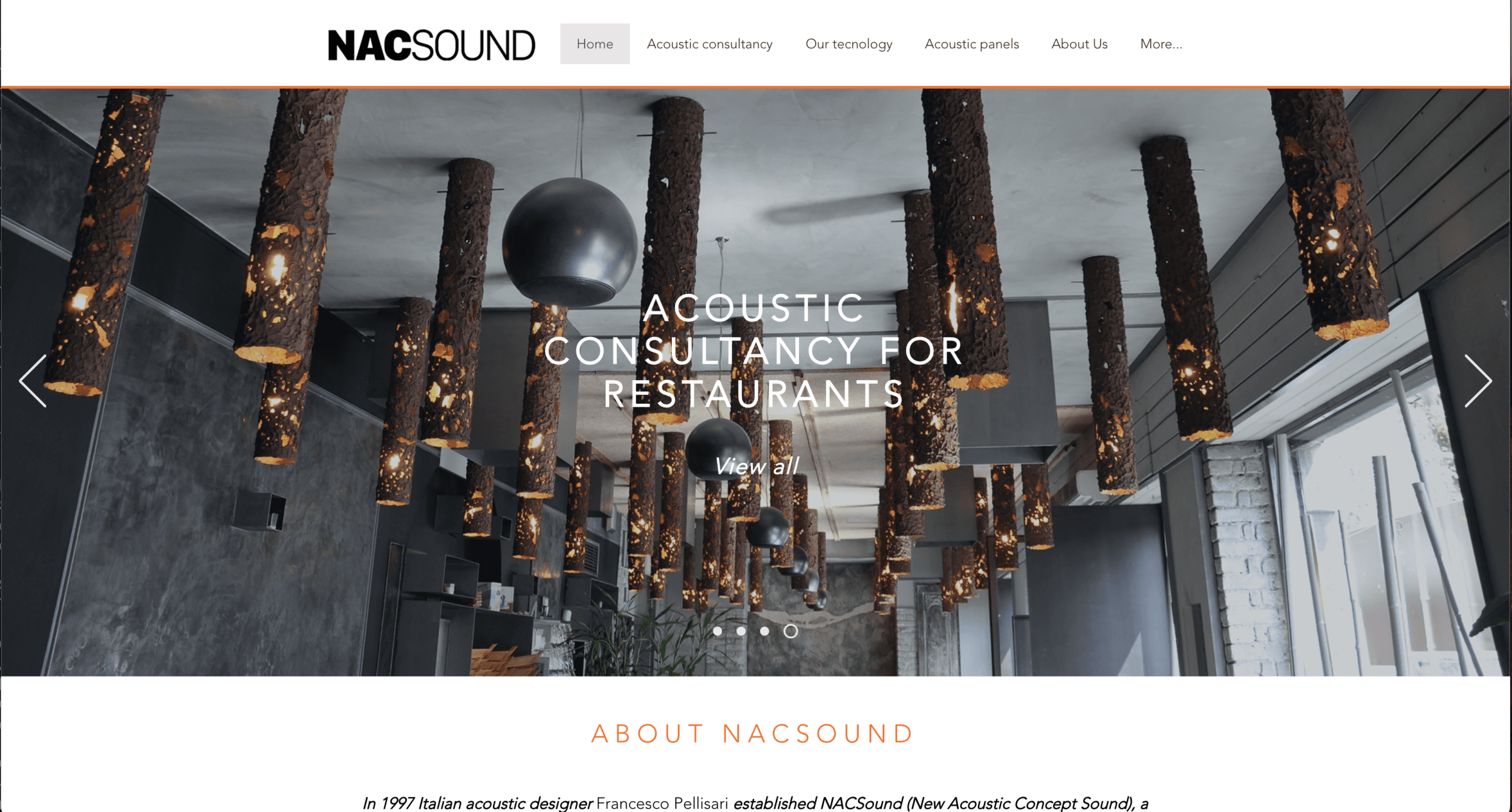
My client’s current website, NACSound, was not generating sales leads for either acoustic consultancy or for his high-end speakers and sound sculptures.
My first task was to help my client define who his target audience and website users are. It became immediately clear that users looking for speakers and sound sculptures were very different from users looking for acoustic consultancy.
This was the first indicator that a new brand should be created for acoustic consultancy. There were also key differences in time availability for the different personas. The website would need to immediately show key terms these people are looking for.
Feedback my client had received about the NACSound from architects and engineers:
- The website did not look like an acoustic consultancy, so there was immediately an issue with trust
- The website looked like either a restaurant or a church depending on which lead image was visible
- Regular services provided by acoustic consultants weren’t being advertised, and this was causing concern for potential clients who need to adhere to particular building standards
Defining design challenges
After an initial workshop with the client, the following challenges were identified:
- A new brand needed to be created to solely advertise an acoustic consultancy, project management and product fitting service. This service was a key differentiator in the market as other acoustic consultancies do not offer this “full-stack” service.
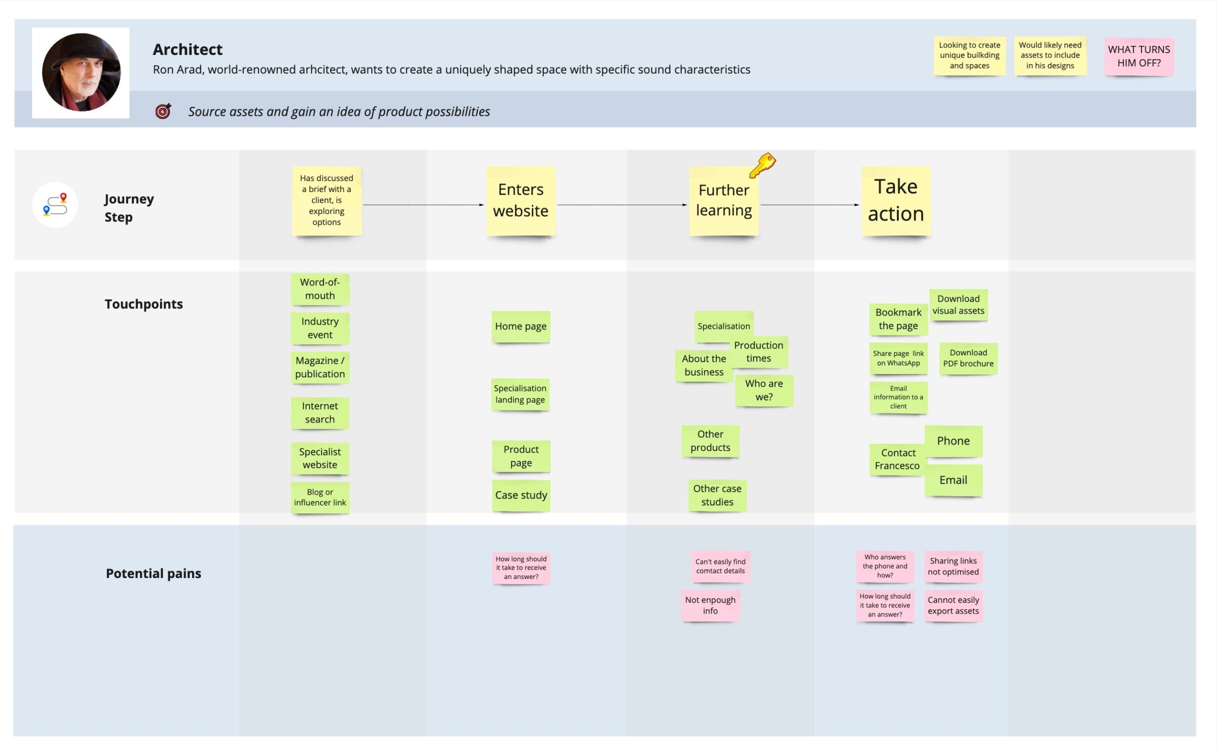
- Landing pages other than the home page needed to be considered (see user journey map). The NACSound website did not feature detailed service pages, product pages for the acoustic panelling, or case study pages for most of the previously completed works.
- The architect and architect-CEO personas were highlighted as key users of this service. These people are time-poor yet still need to quickly understand a good amount of detail about the service offering. This would help to define the content planning.
Competitor analysis
Certain elements were clear from a competitor analysis based on key search terms related to the acoustic consultancy business:
- Competitors almost universally had links to their service offerings on the home page of their website
- All competitors bar one looked industrial in approach, clearly showing they offered environmental noise impact assessment and building site box-checking. This was not something we intended to match as a service offering as my client does not specialise in these activities.
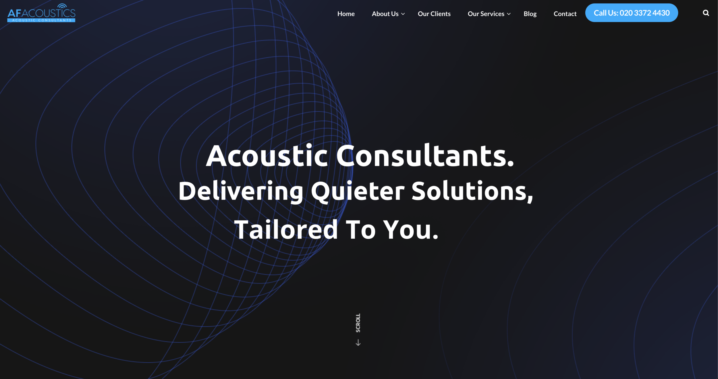
- The competitor that stood out, AF Acoustics, featured an abstract 3D animation of “sound movement” within a space. This was an aesthetic my client was keen to capture.
- Ramboll Group appeared to have the most professionally executed and stylistically well-considered brand approach for their website, even including a custom, gothic typeface of their own.
Design hypotheses
Core offering
1
We believe a headline promoting a full analysis, design and fitting service will be enough to entice potential clients to carry on exploring the website
Peer support
2
We believe an abstract image or video vs real shots of either a church or restaurant, will give better clarity and cause less confusion about my client’s service offering
Brand design

When creating brand identities I tend to lean towards typographic approaches based on visual portmanteaux or negative space treatments (like my own logo).
Wireframes
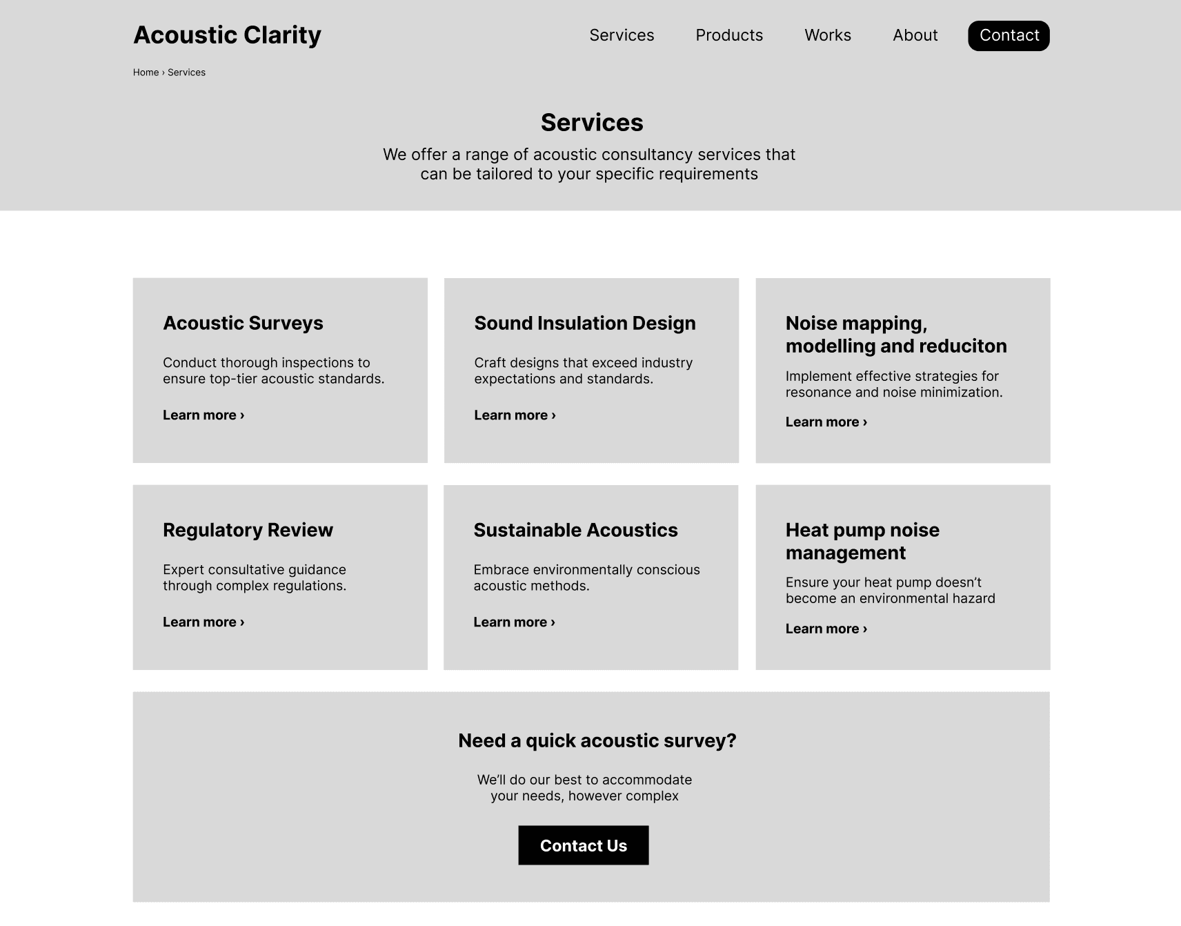
After creating a sitemap (always the first thing I do) I created responsive-sized wireframes to illustrate basic page layout parameters for all key page templates.
When creating wireframes for a project like this, I tend to focus on the overall layout and information flow without worrying too much about the copywriting accuracy. I find that the copy is better created and edited on the live website when building a site myself.
UI design
First iteration
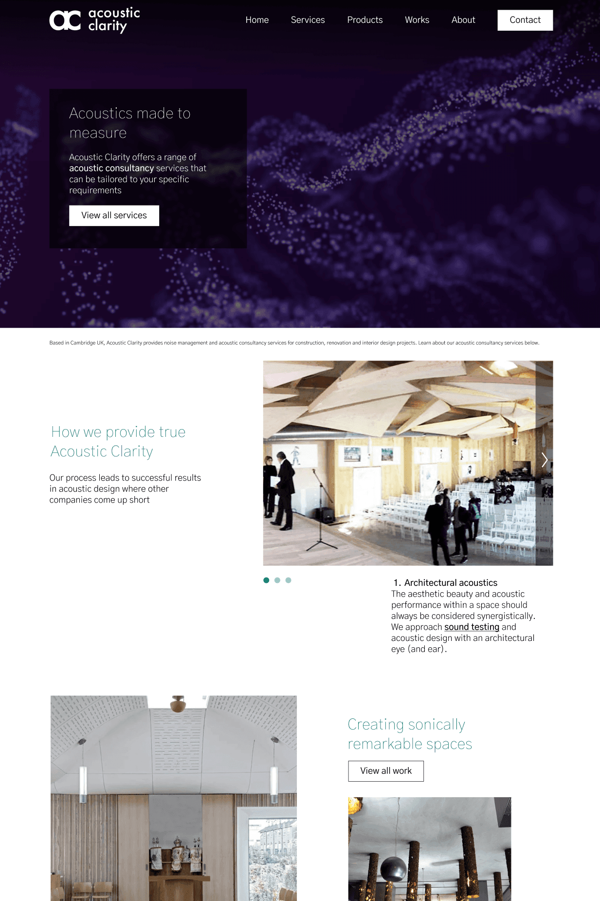
I chose to align to the aesthetic of Ramboll by choosing an asymmetric homepage layout which is pleasing to the eye and allows for good information flow. I also opted for a Gothic Slim font throughout the website.
You will also notice the abstract image background. This replaced an earlier iteration that featured a wide-view shot of a religious venue which was causing issues with ascertaining the meaning and objectives of the website, looking more like a church or synagogue website instead.
Building the site
I built the site using the WordPress platform, which is now surprisingly powerful, offering a huge range of optimisation options and added features. I was able to build complex layouts and site features by utilising a variety of features offered by this platform, to great effect.
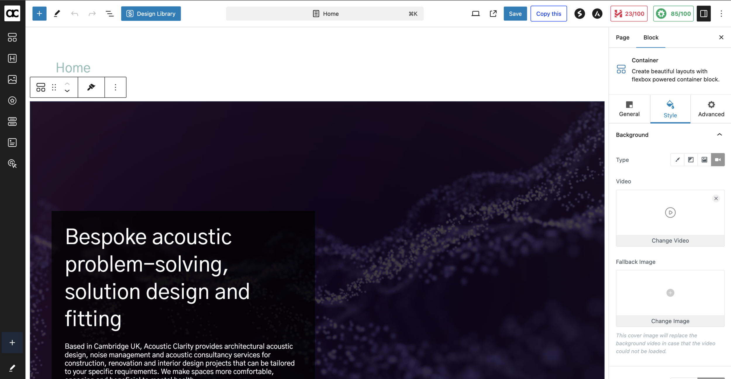
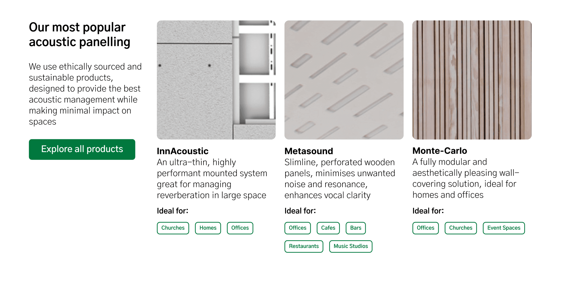
When reviewing the website, updating copy and adding content, I realised the slim gothic font, whether presented large or not, was not impactful on mobile screen sizes. I changed my approach to increase the font-weight while still maintaining the overall elegance of the Gothic font style.
Post user-testing
Hypothesis 1: Messaging – Confirmed
After a couple of iterations, the version we settled on performed well for initial impact and comprehension. You can see this messaging below.
Hypothesis 2: Abstract image – Disproved
The abstract image, while somewhat engaging did not aid in comprehension of what the service offering is about: acoustic solutions for people’s better wellbeing.
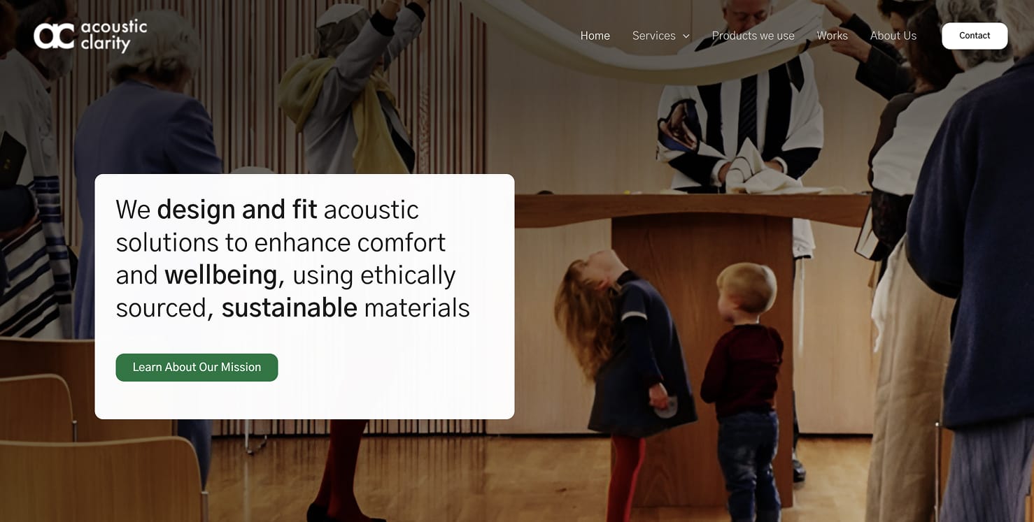
As one of the key brand messages is about promoting positive mental health via acoustic management, this more humanistic image featuring children made more sense and better matches the headline messaging. I still think this could be improved with a specific shot dedicated to wellbeing and sustainable materials, but this shot is good enough and often that’s what you’re aiming for with an MVP release.
Project outcome
I designed and built a website that clearly defines my client’s service offering and is building a solid foundation for future SEO improvements
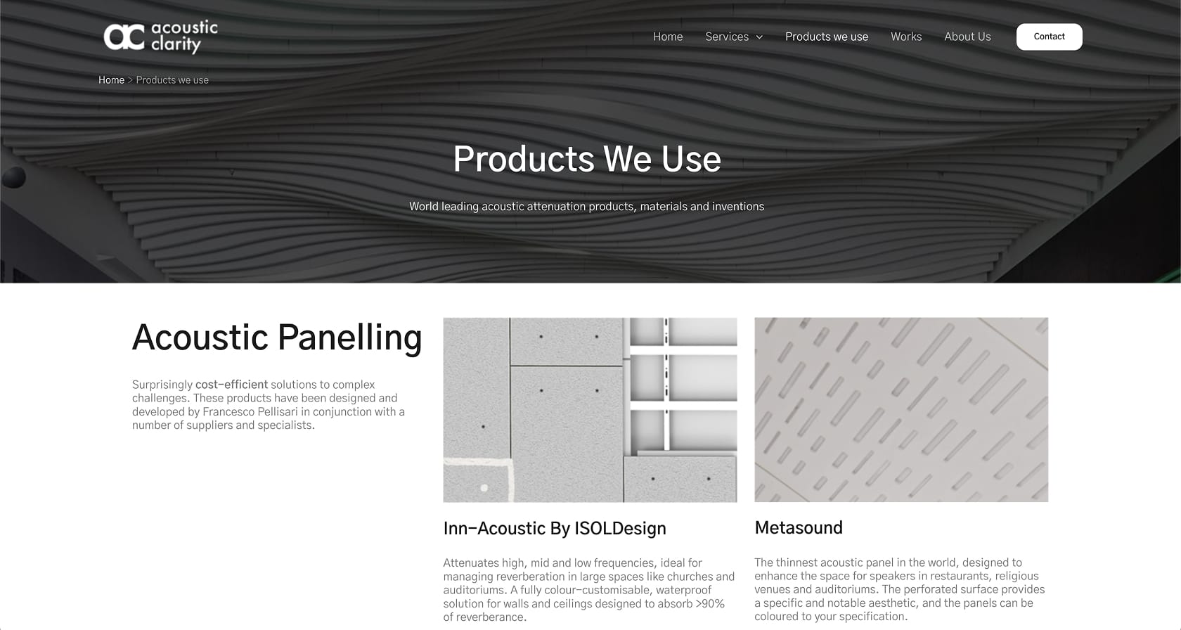
While still in progress of being populated, this website is already performing outstandingly compared to my client’s previous site in Google rankings. It is my sincere hope that this website generates lasting business value for my client for years to come, and I will be on hand to help him explore his new lead-generation platform. See the website for yourself.
See
See the site
