Design Systems: My Top 5
Design systems play an integral part in modern digital product design. They enable rapid scaling across multiple platforms, and harmonisation between design and software development. I’ve used a number of design systems over the years, and been inspired by the great work of creators of others. Let’s take a look at some examples:
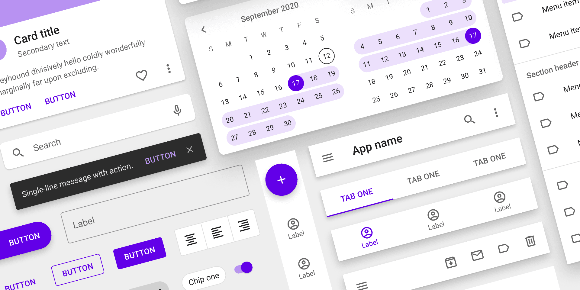
MUI (formerly Material Design)
This system, created by Google, has been iterated over the past decade to become an all-encompassing app and web design and development platform.
Material works great for apps and websites alike. Extensive libraries are available for developers to use components straight out of the box, working with the React framework.
I used the first iteration of Material Design when creating the ASOS app for Android, and it worked wonderfully, enabling faster design decisions and easier deployment for the developers.
Most recently I’ve developed an MUI design system for the Low Carbon Contracts contract management system, Zero.
Pros:
- Almost all UI elements you could imagine are catered for
- Styles and typefaces are managed in a considered, highly organised manner
Cons:
- Can sometimes be more than you need for your project, adding complexity
- Being deeply integrated with code components is a double edged sword – so much is defined as standard that there’s little room to deviate if trying something creative and this can be a challenge for developers and designers alike.
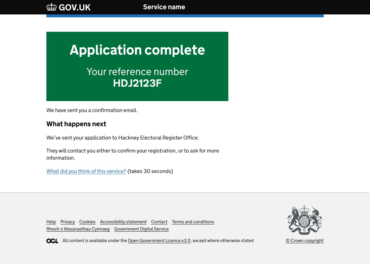
Government Design System (GDS)
In the UK, most governmental and local government websites are moving to this approach.
A simplistically styled system based on clear typography, this design system was created to harmonise and simplify the vast amounts of information held on government platforms.
Principles such as progressive disclosure in forms, links being clearly highlighted and primary colours used for minimal colour coding make intentions clear in an otherwise busy environment.
I’ve used this system to create concept pages and found it easy to get along with.
Pros:
- Well understood by dev teams who build and maintain governmental websites
- One of the most accessible / inclusive design methodologies you’ll find
Cons:
- The text-heavy nature often leads to admins creating lengthy, painful to read web pages with little in the way of visual stimulus to break up the monotony.
BBC Gel
A personal favourite of mine, BBC Gel was one of the first design systems to be codified and publicly published.
This system is designed to cater for the broad range of multimedia interfaces presented on BBC platforms. The system is applicable to web, app and print, with provisions even included in the typography guidance for billboard advertising.
Of particular note are the naming conventions for text sizes. Rather than small, body, heading, they use descriptive names like Paragon, Primer and Brevier, which somewhat hint at the purpose of the text size without adding any unwanted semantics. This means that extra sizes can be added above, below and in-between each of these sizes as the system is expanded, without any loss in meaning. Genius.
Pros:
- An open, flexible system that allows content to be created in many different ways for different platform
- Highly detailed and succinct while remaining easy to access (and fun?), which embodies the spirit of the BBC
Cons:
- A little a non-descriptive in some areas such as tab bars and other app-based elements
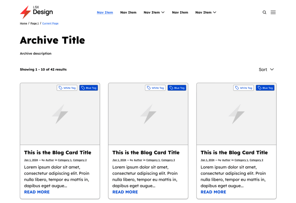
LSX Design System for WordPress
Specifically designed to work in tandem with the LSX WordPress Block theme. The intelligent, modern approach to WordPress website design makes it much easier to build sites exactly as they’re envisaged at the design stage.
In the past, designing for WordPress could be a bit of a minefield, especially if you were building the site yourself. Lots of coding, custom elements and even self-made plugins would regularly break on WordPress updates.
Design systems like LSX are created to work alongside well supported and up to date WordPress themes.
Pros:
- Works out of the box with WordPress, still an extremely popular publishing platform
- WooCommerce integrations make it much easier to design and build an ecommerce platform or features
Cons:
- Some functionality might have been rendered redundant by the Gutenberg editor and the standard list of stock components that can be saved as patterns
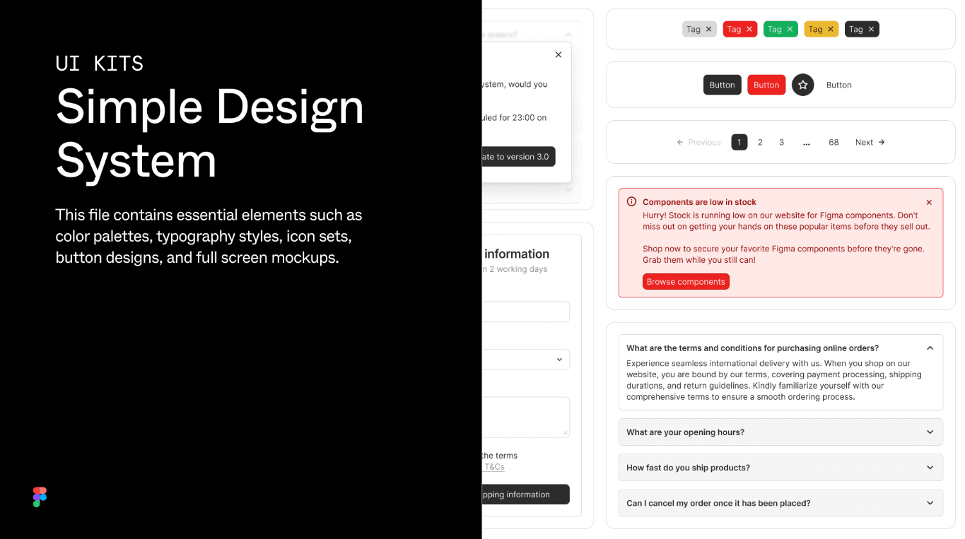
Figma Simple Design System
Compared to other design systems on this list, Simple Design System is much more basic – but that’s the point.
Often when starting a design project, you just want to get some ideas down. Maybe you haven’t been able to discuss the system you’ll use with developers yet. This system enables rapid design, featuring some very handy little additions of common components like login forms, which make journeys simple to envisage.
I’ve used this system and found it really easy to get along with.
Pros:
- Easy to use, easy to access
- Code snippets available in Figma so devs can build this system with minimum hassle
Cons:
- Too basic for complex design needs

