
Nail the navigation to save the company
MOONPIG | ECOMMERCE
The challenges
- SEO and overall usability of the Moonpig website had been heavily impacted by a new, experimental navigation design launched as part of a brand refresh. The deficit in visits to key category pages was catastrophic for business. Paid SEO was keeping the company afloat, but this added a huge overhead.
- The Moonpig site also had other taxonomy issues such as no clear site hierarchy, unclear product relationships and somewhat confusing, reductive products filters.
- These issues combined to create many issues for users and negatively impacted sales. I led the exercises with a small team of UX-ers to understand the problem space and define testable solutions
Core duties
User Experience Strategy
Aligning with SEO plan and overall company strategy for short to medium term
User Experience Design
Personas, User Journey Mapping and Wireframing for web
UI Design
Visual design of navigation menu and site header
Analytics and Behavioural Analysis
Using Google Analytics and Hotjar to understand user behaviours at scale
User Research (remote)
User testing on current website and user testing on design concepts
Discovery
We gathered all the data we could from the current web experience, including detailed analytics and user testing videos. It was clear that the following features were causing particular issues for users:
- The new navigation and legacy filters mechanism were causing conflict with each other. People were misunderstanding how the nav functioned
- Search was being under-utilised and was not providing accurate results based on common search queries
- The filters, being reductive in nature, were confusing for users.
- Cross-sells attach rate was assumed to be low at 2%. Considering this website sells cards and gifts, extra treats and gifts should have been performing much better.
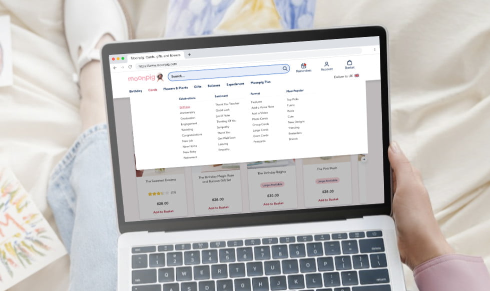
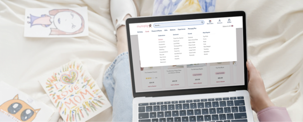
Search and navigation were performing poorly. Users were not able to find the products they needed. A highly unusual method of navigating to products had been created, essentially using a dynamic filters mechanism as primary navigation for the website. While this had performed well for comprehension in earlier user testing, this approach had massively impacted SEO. The site no longer had a clear tree structure. Many organic links to landing pages that performed well in the past were suddenly unavailable, or the pages had been de-ranked as search engines were suddenly unsure of the website structure.
There was also a somewhat old-fashioned approach to landing pages. These pages were a mixture of navigational and promotional elements, and weren’t providing users with what they needed when landing on the website. We saw this in analytics where bounce rates were higher than expected and in user testing where participants were either confused or took a lot of time to understand where to go next. We assumed this was because users were looking for deeper, sub-category navigation in a menu rather than somewhat confusing and promotional in-page navigation.
Defining design challenge / hypotheses
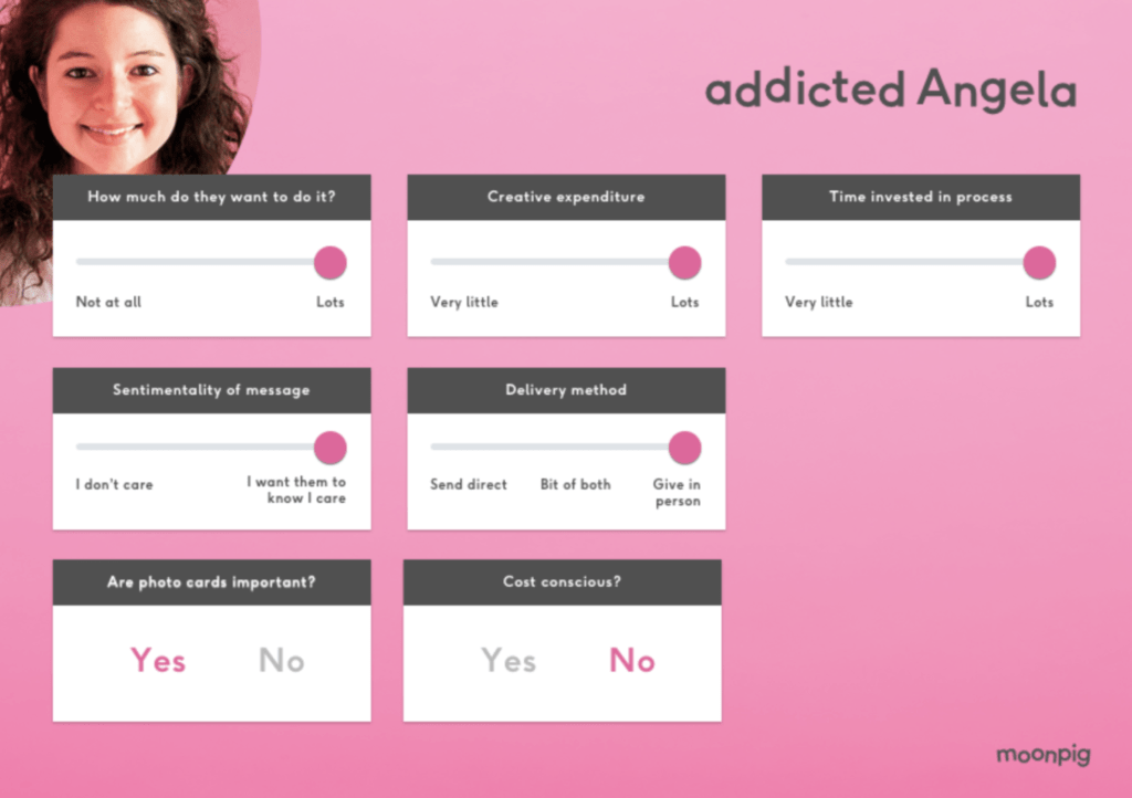
The first thing we needed to tackle was personas. Moonpig’s personas were out of date and didn’t match consumer buying behaviours. We formed what we called proto-personas based on behavioural insights from analytics and onsite survey feedback. For Moonpig shoppers, key differentiators were factors like how much they enjoyed the process (time investment, creativity), sentimentality of the message in a card, cost-consciousness.
For each persona we created a realistic scenario they would follow based on these core principles of information retrieval / finding products:
- Unknown
- Known
- Exploratory
- Re-find
For example, Eddie was attempting to find an Anniversary card for his wife. Having done this before, he knew the style of card he’d like. In this instance he wanted to find a suitable bunch of flowers to go with the card, something he hadn’t done before, and he’d be having the products delivered to his home to give in person. This journey mixed Known and Exploratory modes of navigation. Roger, on the other hand, was finding a birthday card for his gran. He hadn’t used the Moonpig service before and wanted to spend as little time as possible doing so, and send the card directly to her. This was an Unknown information retrieval type. These user journeys came into play later when we tested the navigation. Participants would be asked to search for products in these categories.
We performed an exercise of collating assumptions that were based on data from the discovery period, and worked the assumptions through to hypotheses. Here’s an example of how we applied this:
| Assumption | Data source | Hypothesis | Measure of success |
| The current main navigation does not have specific enough links for sub-categories | User testing – participants unable to find what they needed | We believe that exposing extra levels of sub-categorisation in the navigation will help customers find ideal products more quickly | User testing positive results compared to control, AB testing statistically significant increment in Add to Basket / Checkout conversion compared to control |
An extra constraint added to the design challenges we faced was to break down the changes we made into distinct, provable tests. We needed to create an overall vision for product navigation, but then work back from that to create user tests and AB tests to prove each hypothesis separately. For example, we believed that surfacing key occasions at the top level of navigation would be beneficial to many users of the website. However we first needed to prove that a menu-based navigation structure would work using the categories currently present (Cards, Gifts, Flowers).
Design, testing and results
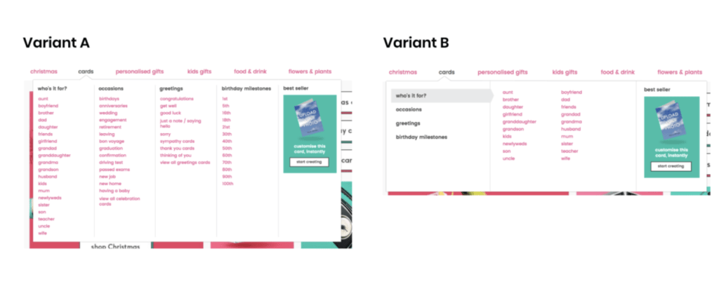
To test the hypothesis above we created a variant of the navigation that exposed more sub-categories, following a more traditional mega-nav approach.
We first tested the organisation of the menu using an open card-sorting exercise using the Optimal Workshop service to uncover user mental models. We found that the following grouping had the strongest correlations between users:
- Recipients
- Ages
- Occasions
- Gender
We then performed a closed card-sorting exercise to confirm the results.
To understand potential interaction models, we user-tested the navigation by creating an interactive prototype, and then creating a number of scenarios that a user should follow to find products. Participants were instructed to use the navigation menu to find what they needed, based on the user journeys we envisaged when creating the proto-personas. While this was not a true representation of real-life navigation where users often look for visual markers or use a search engine in conjunction with menu navigation, we felt that this was the best method to test the menu itself.

As well as the category organisation, were also tested two different interaction patterns.
When compared against the For who / For what dropdowns, 7/10 participants found the sub-category navigation method easier to use (2 participants against, 1 undecided). A verbatim positive comment:
“The categories are all visible, laid out in an organised way. I like it.”
Variant A (vertical lists) interaction pattern was regarded as easier to use by 9/10 participants compared to Variant B (flyout). We took care to add delay and all best practice controls for the flyout variant, but users preferred to have the lists exposed so they could see the range of products at a glance.
When we AB-tested, this first step towards the eventual vision of better navigation resulted in a 2% uplift in completed orders vs the control. This equated to around £1 million incremental revenue.
Impacts of this work
Alongside a programme of AB tests, website updates based on SEO, and further user testing on design iterations, the overall impact was an uplift of around £15 million in revenue, with a +127% increase in visits.
The foundations created by this project were baked into the operations of the Search product team, with incremental improvements being made to the Moonpig website over the following months and years all influenced by the vision we created in our concept and design activities. I’m very proud of what we achieved here. Moonpig was in dire straits financially, and we quite literally saved their bacon.