Making the weekly supermarket shop easier for South Americans
RAPPI | ECOMMERCE
The challenges
- Rappi was (and is) one of the fastest growing companies in South America. The combination of Deliveroo-style take away delivery, just-in-time supermarket deliveries, ecommerce and a bunch of other propopsitions combined to make a super-service the likes of which are only matched by WeChat in China.
- The leadership at Rappi were keen to continually drive business growth and were laser focused on making the customer experience the best it could be. An already complex app would take some very careful thinking in order to make user experience improvements.
Consumer packaged goods
My job was to lead optimisation activities for the Consumer Packaged Goods (GPG) section of the Rappi service. This covered supermarkets, mini markets and pharmacies, with a mixture of rapid shopping, larger grocery baskets, emergency pharmacy orders and prescriptions.

While Rappi had been very successful up until that point, the simple horizontal scrolling aisles were starting to struggle under the weight of their inventory.
I recognised that if customers wanted to find items, either by browsing or searching, the current navigation experience would need an overhaul throughout the shopping journey.
Simplifying navigation
Navigation of complex categories is generally in approached in two ways:
- Visual navigation (pictures or icons with category labels)
- Navigation menus
Users generally prefer visual navigation. Rather than needing to assimilate complex, text-based navigation trees. However, this approach can be compbined with a menu-based approach for complex or deep categorisation.
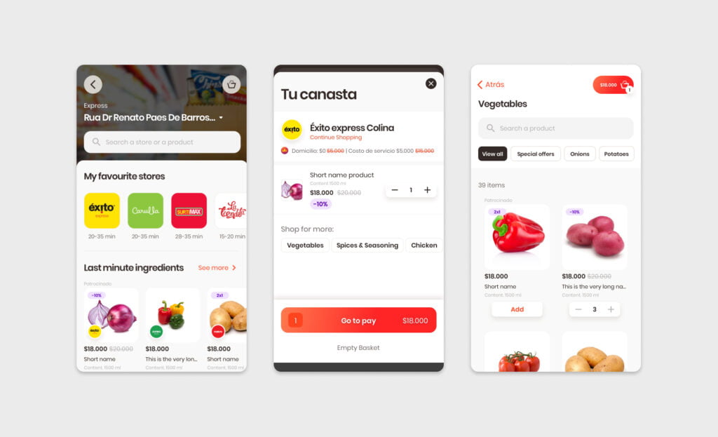
Visual categories were suggested as an addition when searching for a store. Rather than the user needing to select a store before shopping, this method enabled a more Marketplace-like experience where a shopper could browse products from popular categories, and then choose which store to buy them from. These quick-links have long been a successful pattern in online shopping. In this example, visual navigation is used as a method of bypassing the decision point of choosing a store. Popular food groups are suggested, which take users to an “aisles” like view where they can choose these products from different stores.

A categories list in each store was also added to provide a simple, easy to scan form of navigation when users were lost. Rappi users regularly reported they would become disoriented when scrolling down a page full of “aisles” so the simple category list was a welcome addition.

Location and purpose-based shopping
Rappi has some particulars for navigating to stores, which generally needed to relatively near to where they live. Nearby stores were generally prioritised but this wasn’t always what customers wanted, especially if local stores had limited choice. Rappi Tenderos (riders) either use bicycles, motorcycle-scooters or cars. for larger purchases, scooters and cars were generally used, but that was based on local availability. The system powering Rappi’s store availability took these factors into account in real time, promoting stores with available drivers. This meant that users needed some idea of how they were going to shop before looking for a store (lrage shop vs small shop).

As well as category navigation, product navigation was a key point of interest for Rappi. As customers might regularly be looking for fast, specific items, these could be presented higher up the browsing funnel rather than forcing users to wade through multiple levels of navigation.

Basket: guided navigation
Shopping baskets are often overlooked as a place where extra navigation can be added. In this example, I added extra category links to the basket that intelligently adapted to the current basket contents, suggesting complimentary categories.
When viewing a shopping basket like you see here, it’s not always clear how to continue shopping. Often, obvious continue shopping buttons are added, but the business leadership at Rappi were keen to explore other options. My suggestion took into account existing systems at Rappi, while presenting information in a different way.

Results
Many changes were made throughout the Rappi CPG customer journey resulting in faster routes to purchase and more satisfied customers.